Project: Forward 175
Client: The Henry Davies Webster Charitable Fund
Role: Art direction, visual Identity and illustration
Supporting courage, big and small
One of Henry’s lists was titled “My Favorite Villains Who Get Defeated.” Tattered and ragged around the edges, it was clearly consulted and updated often, and contains 174 typed and handwritten names. Forward to 175 speaks to a desire to add “cancer” as the next defeated villain on Henry’s list.
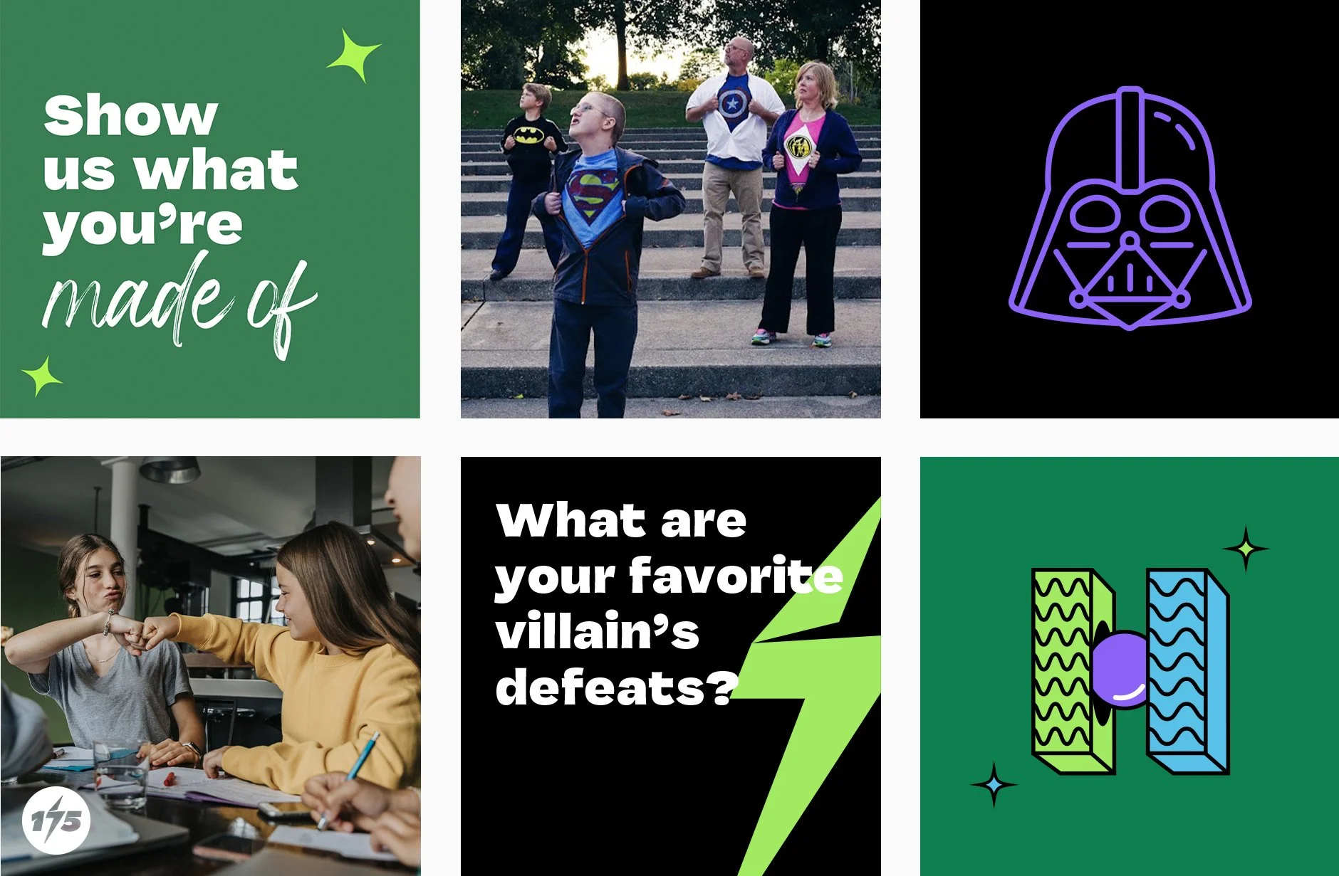
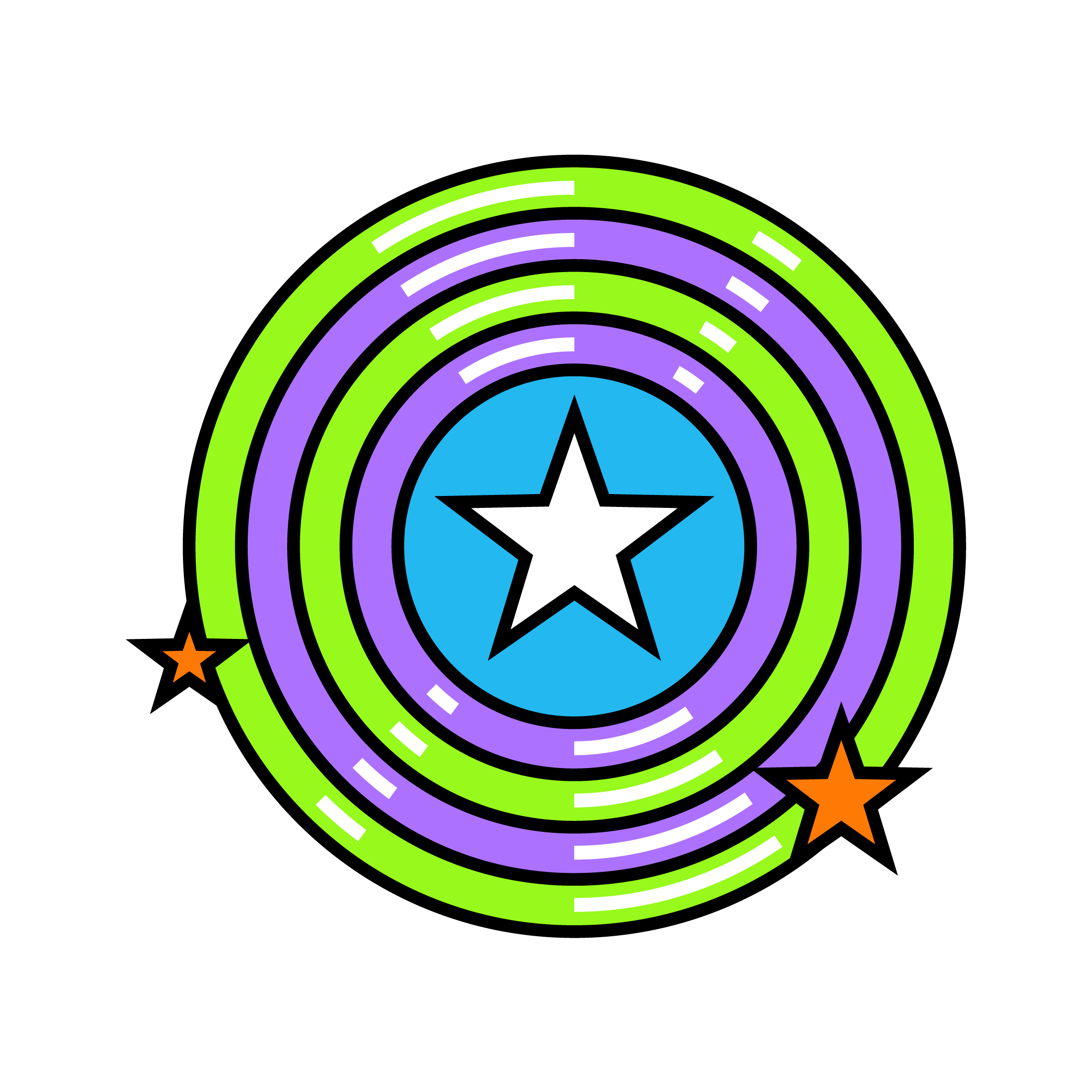
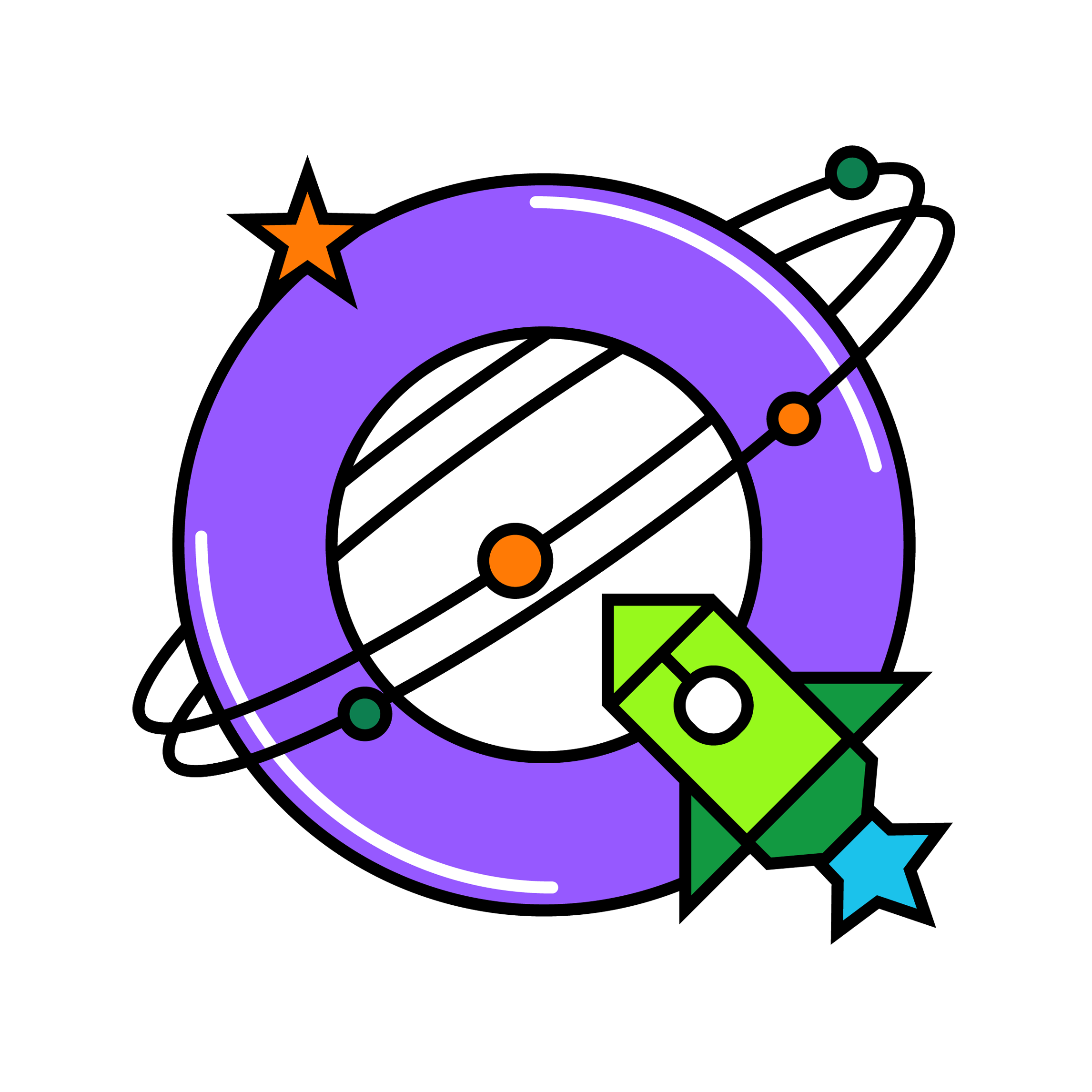
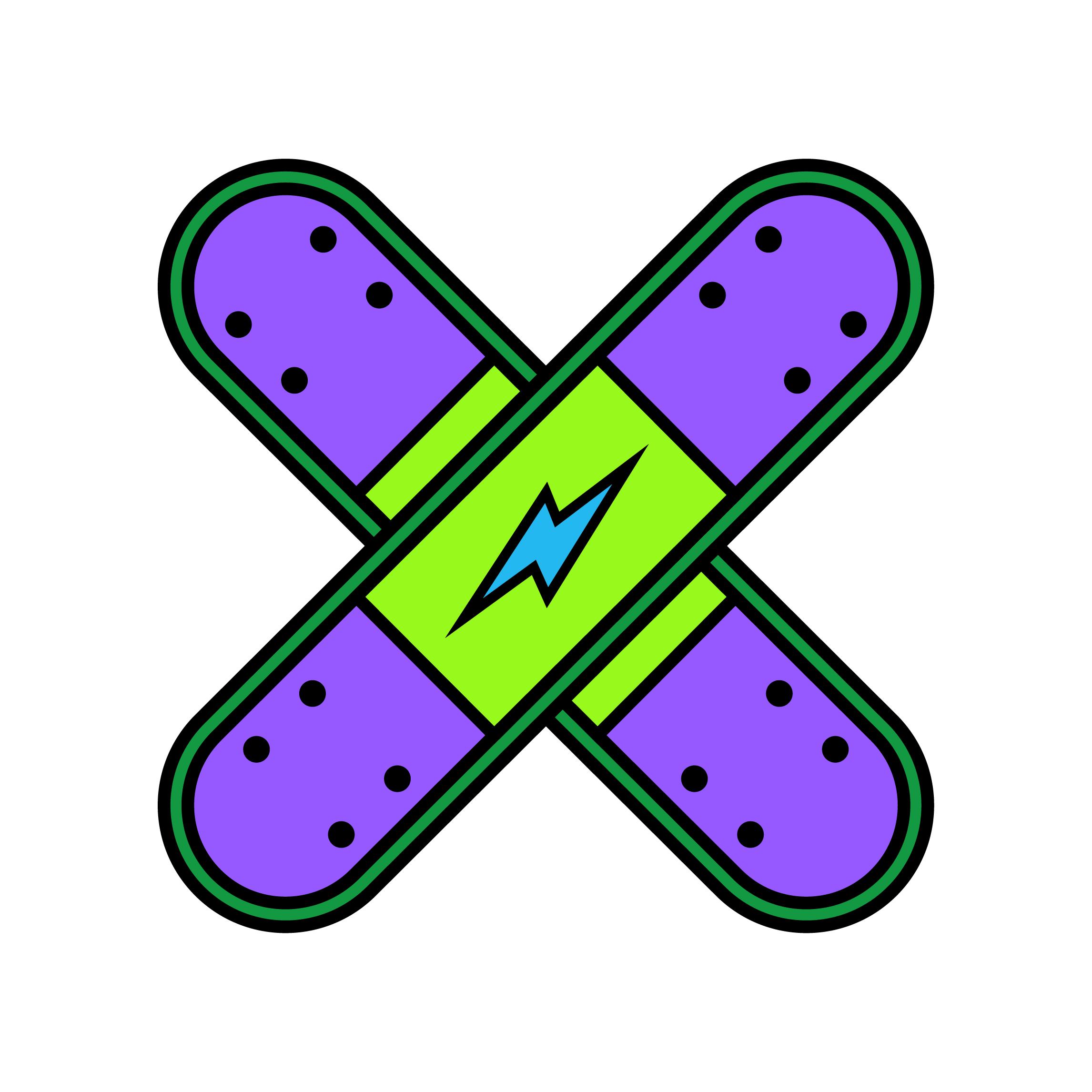
A dynamic lightning bolt energizes our logos, honoring everyday heroes fighting cancer and supporting people affected by it. The formal logo, primary logo, and symbol each come in color variations and small-scale versions.
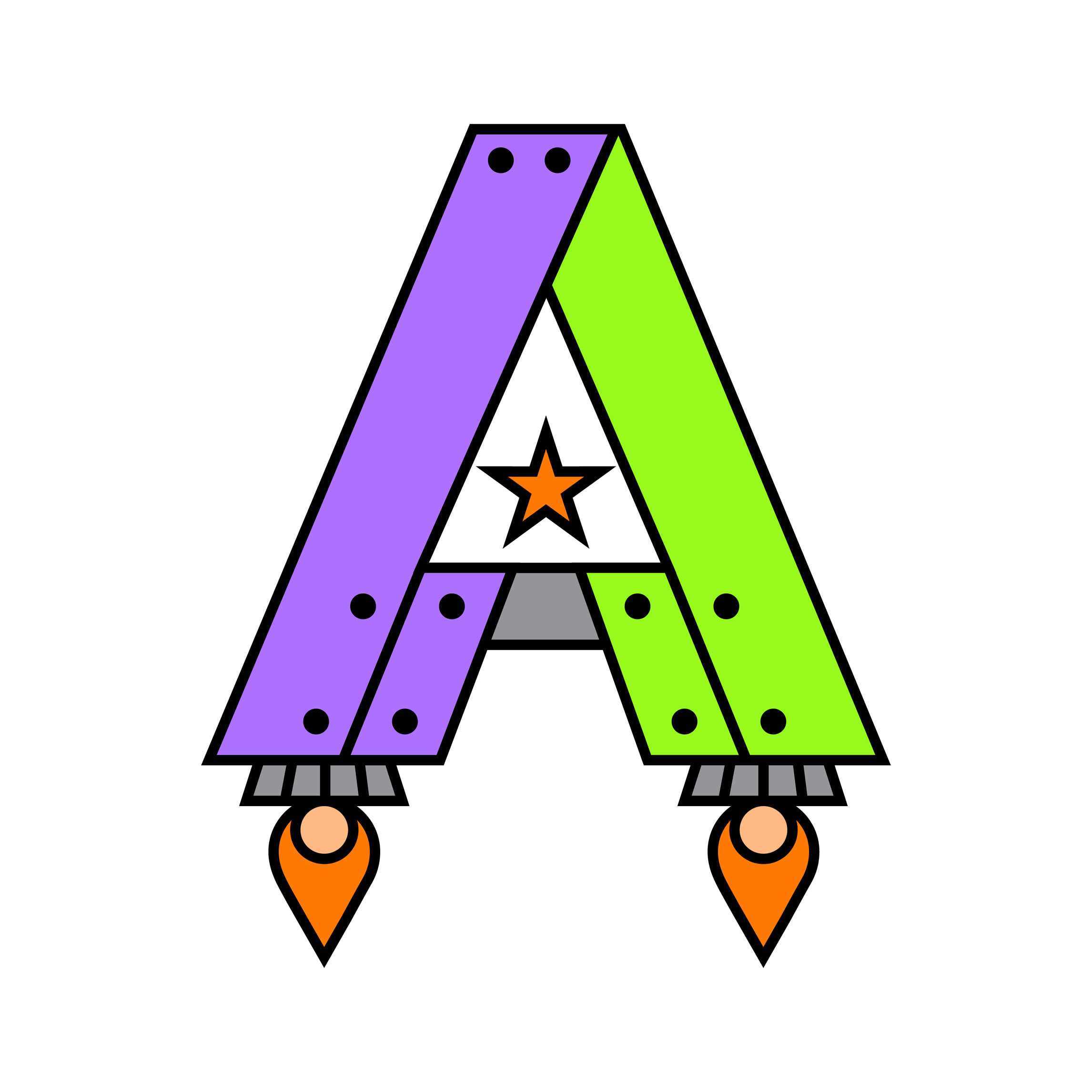
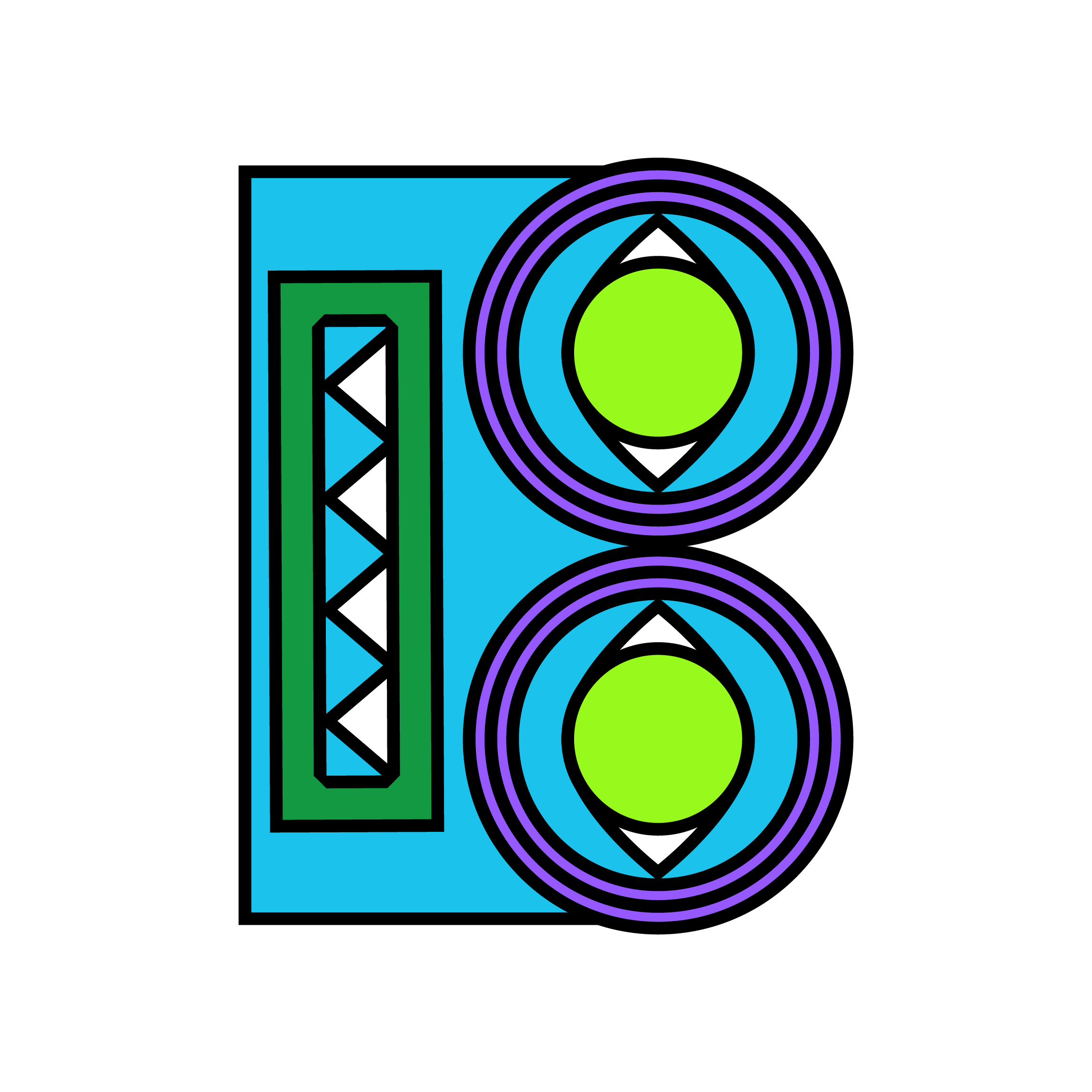
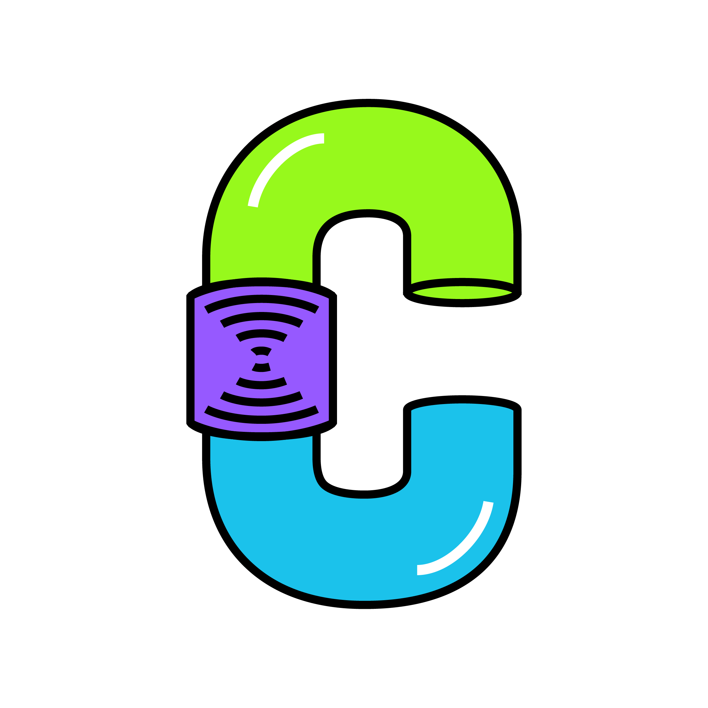
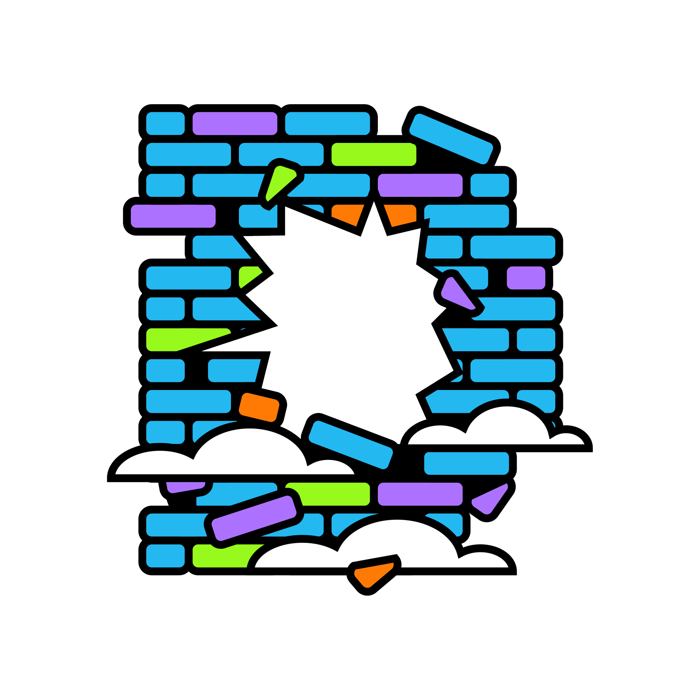
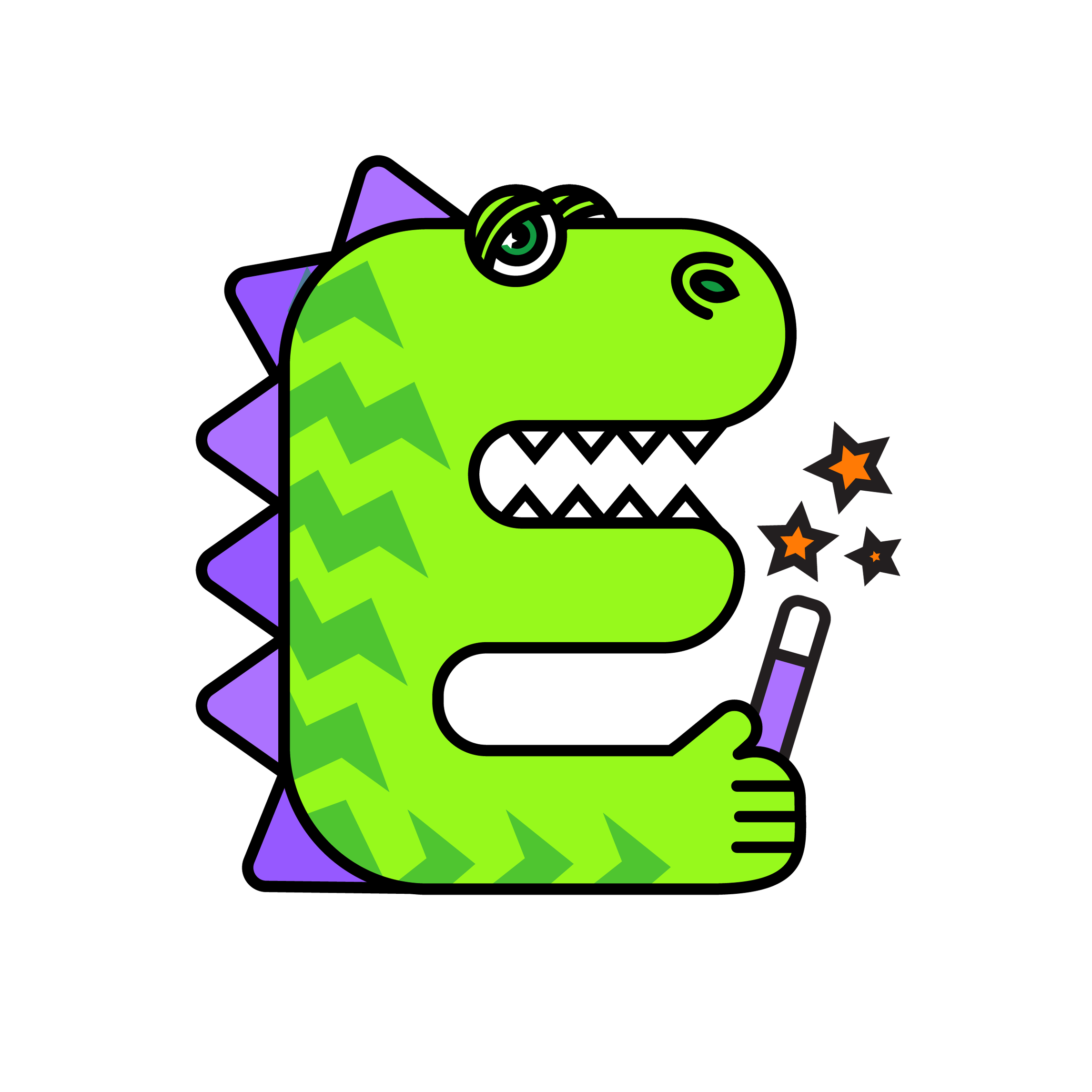
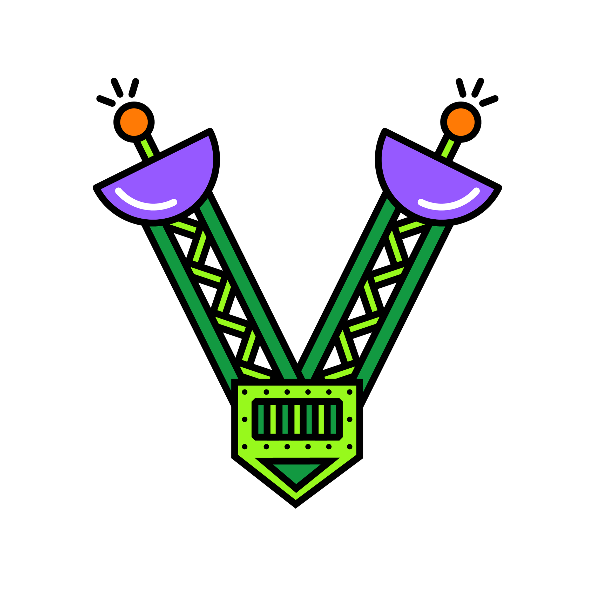
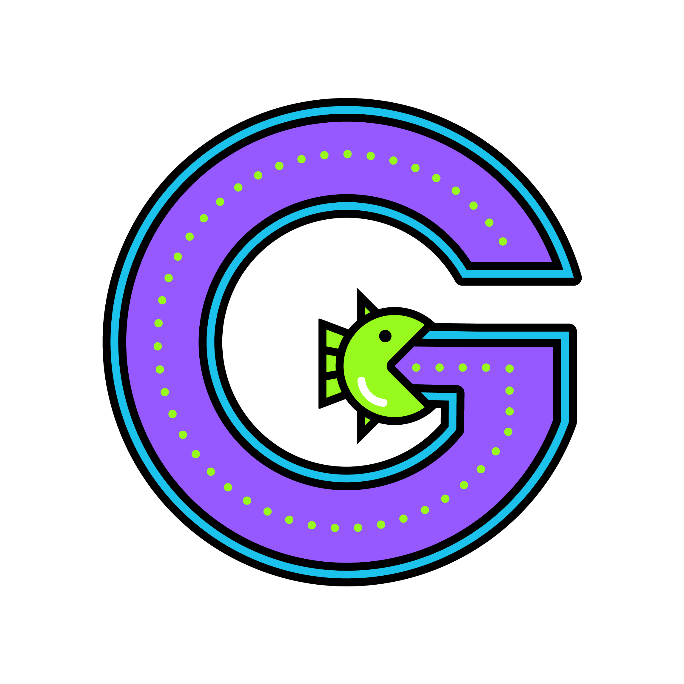
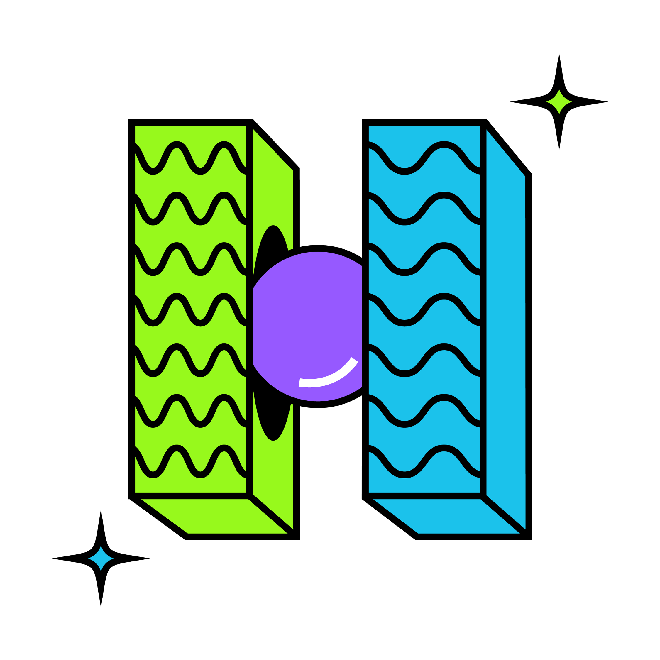
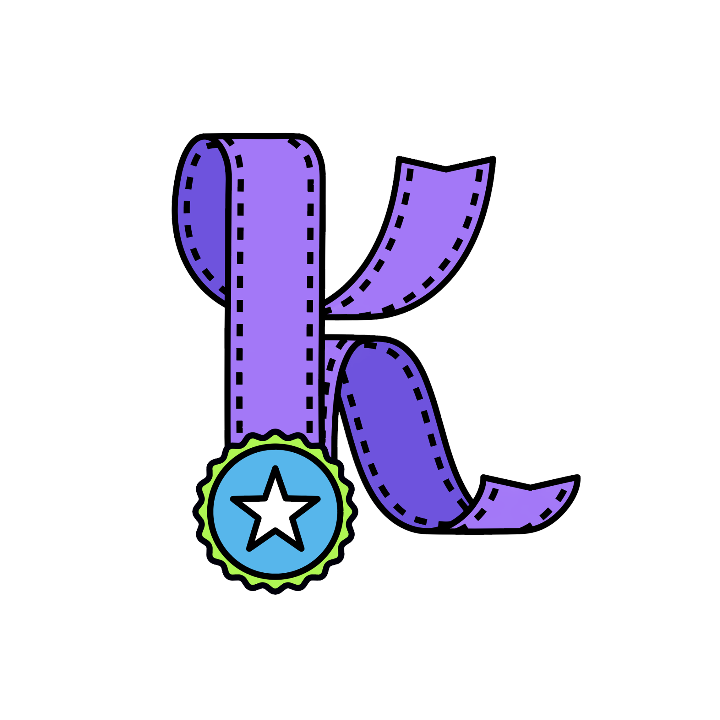
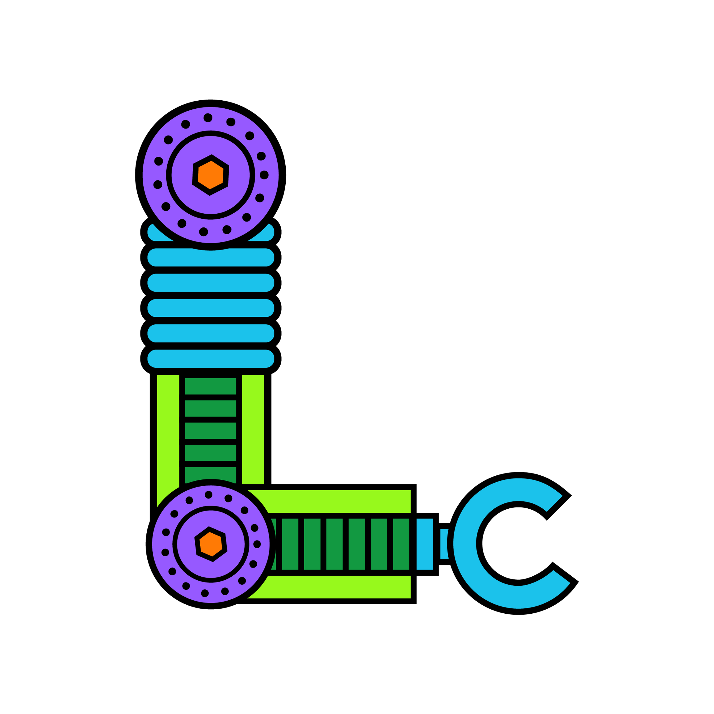
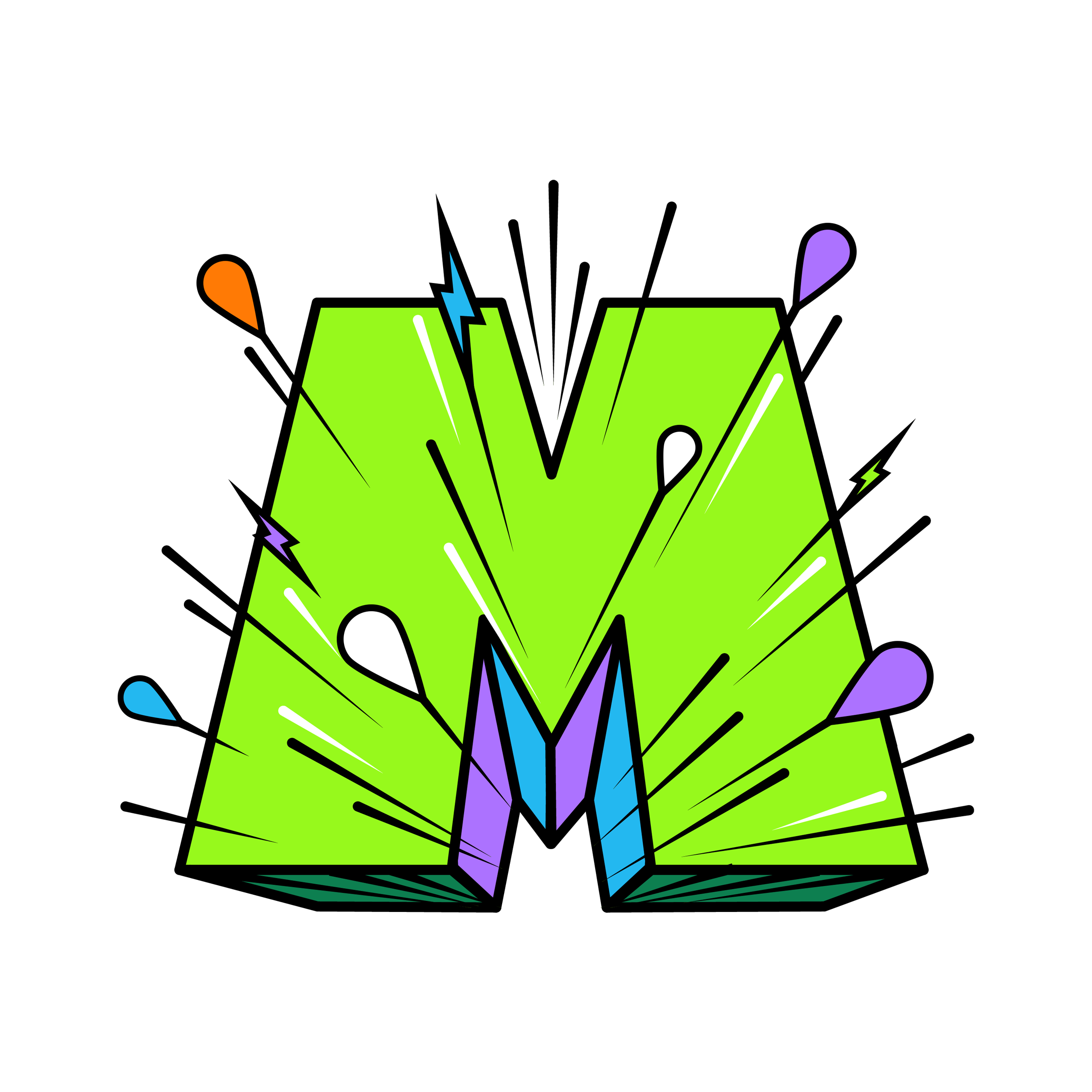
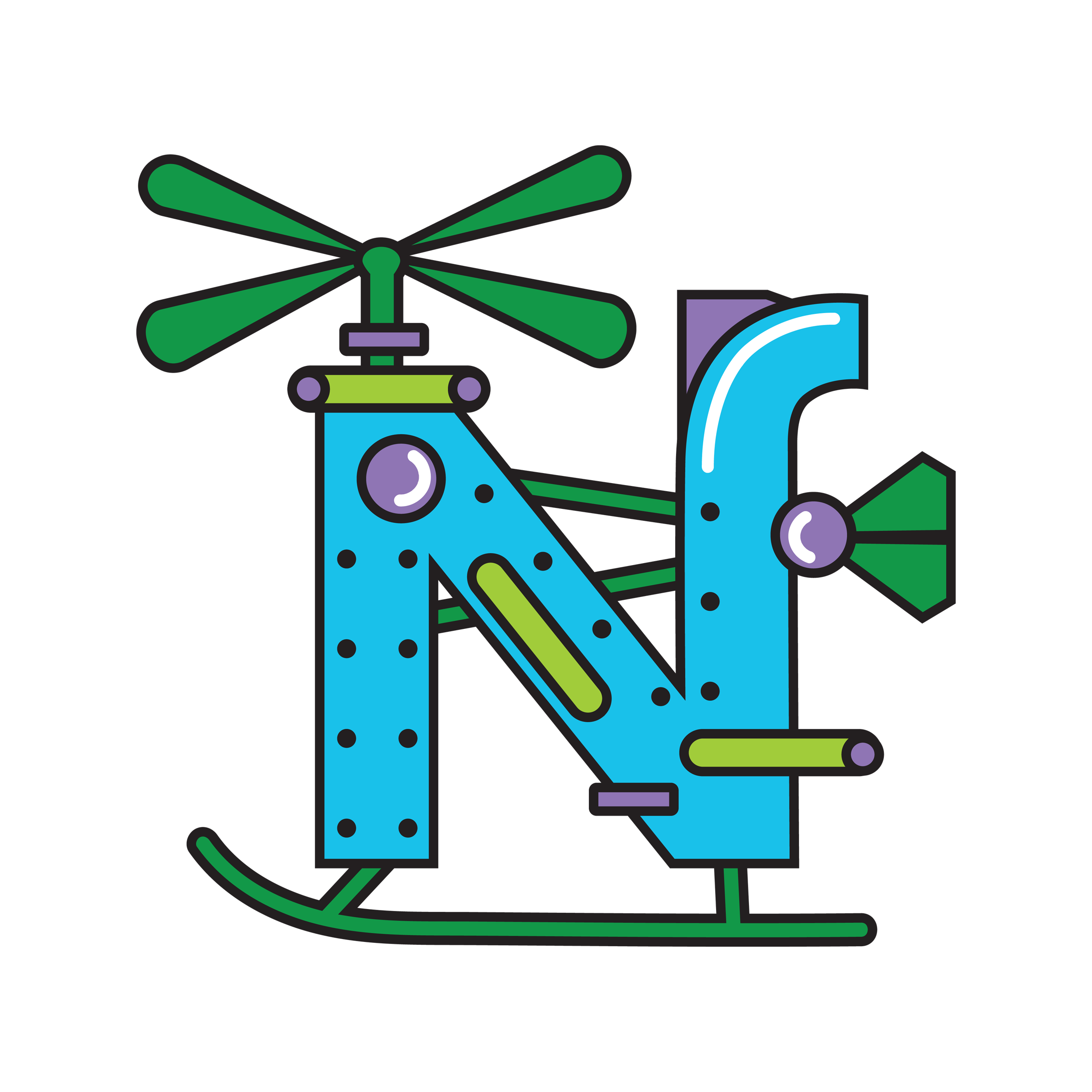
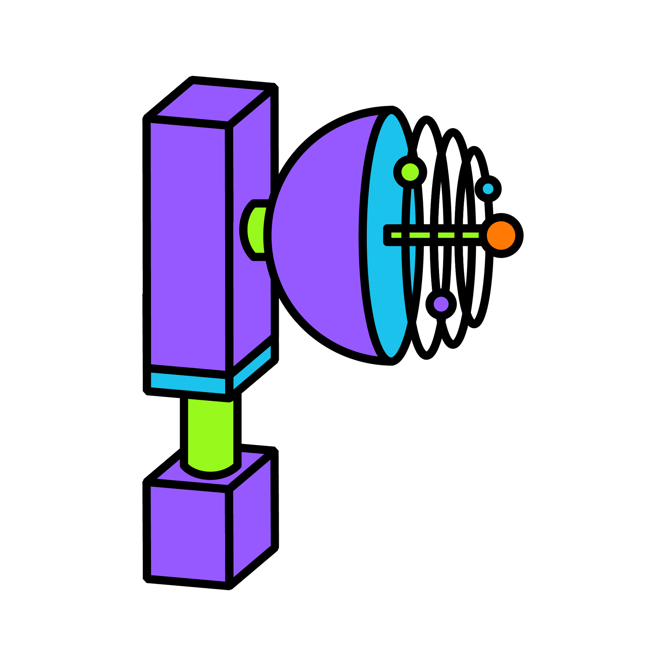
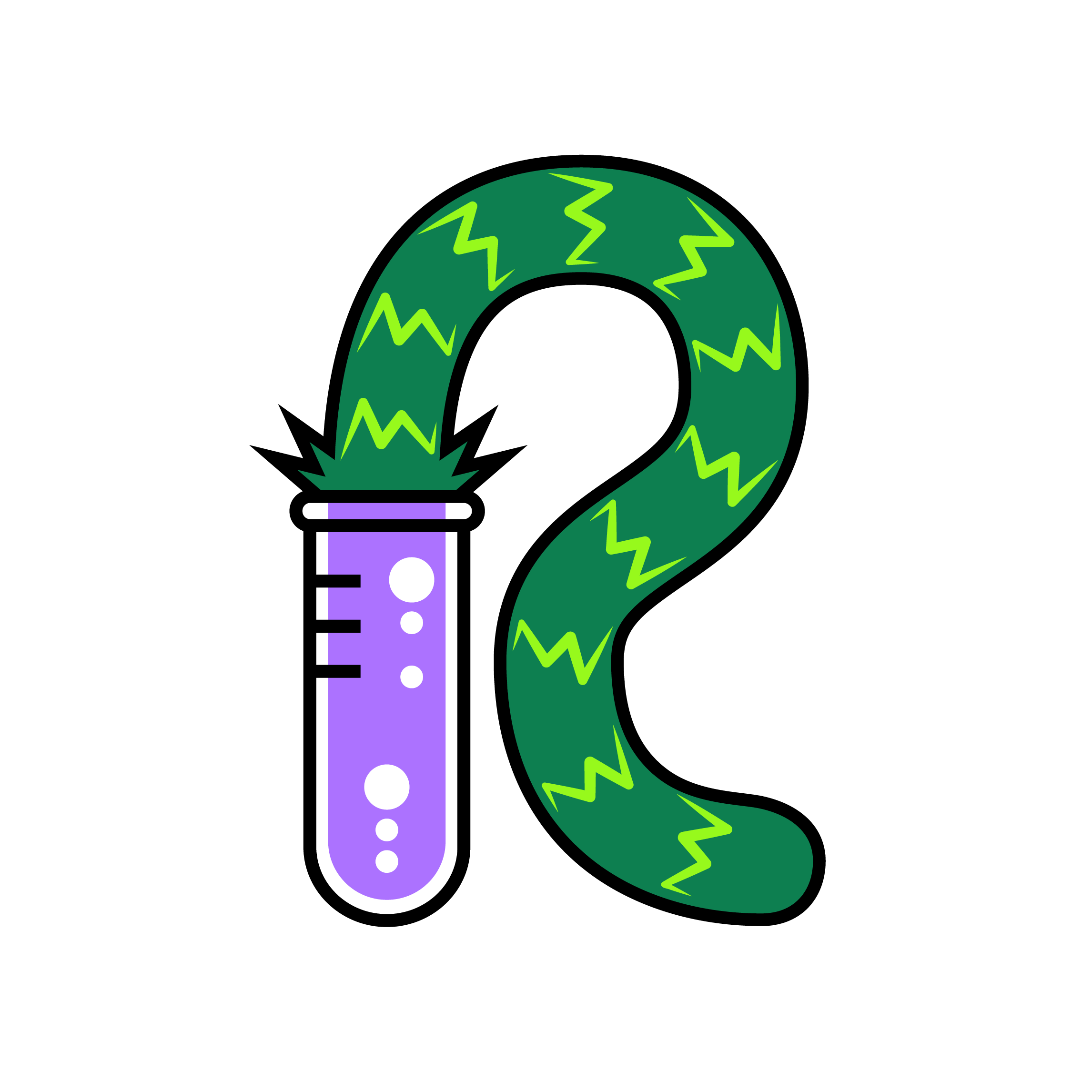
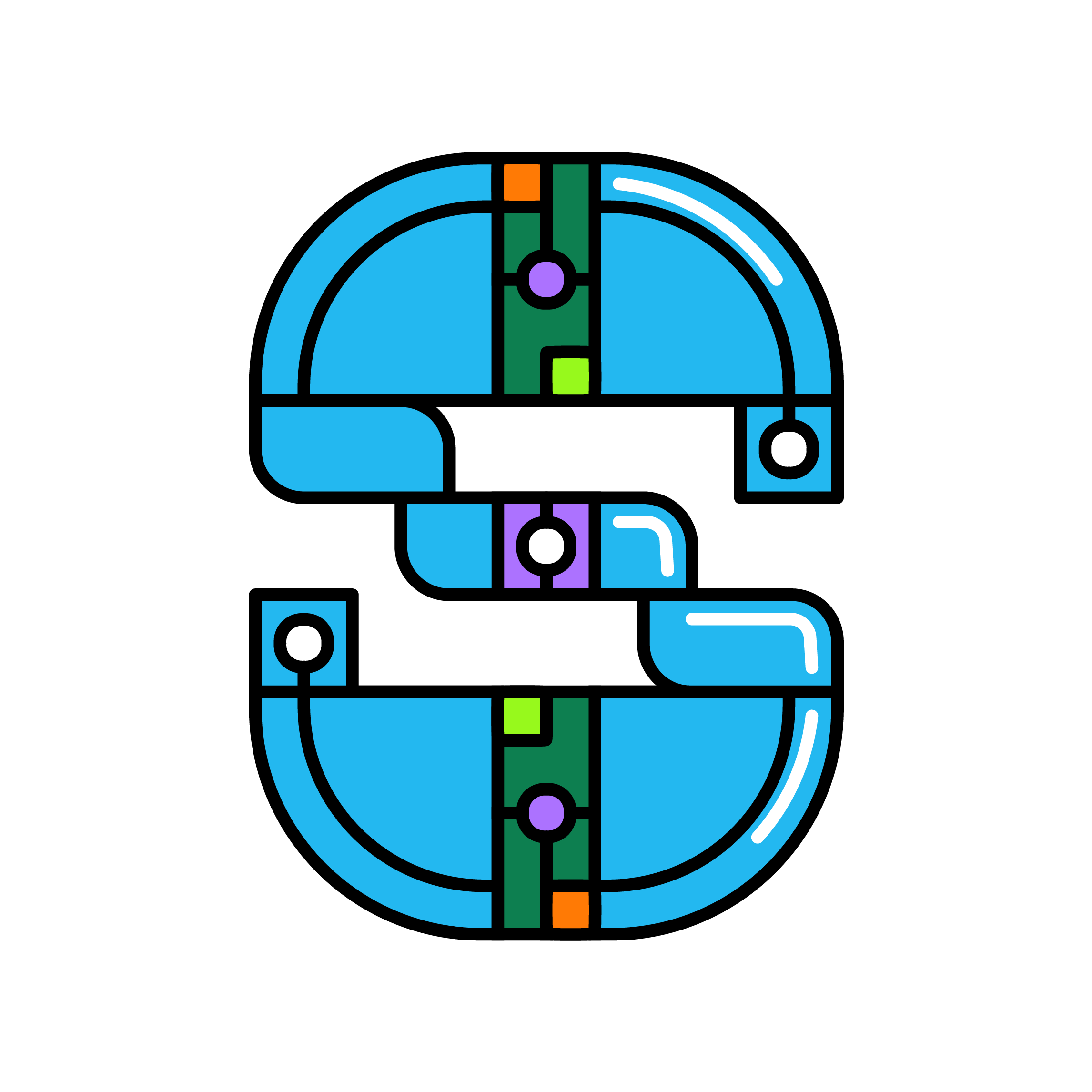
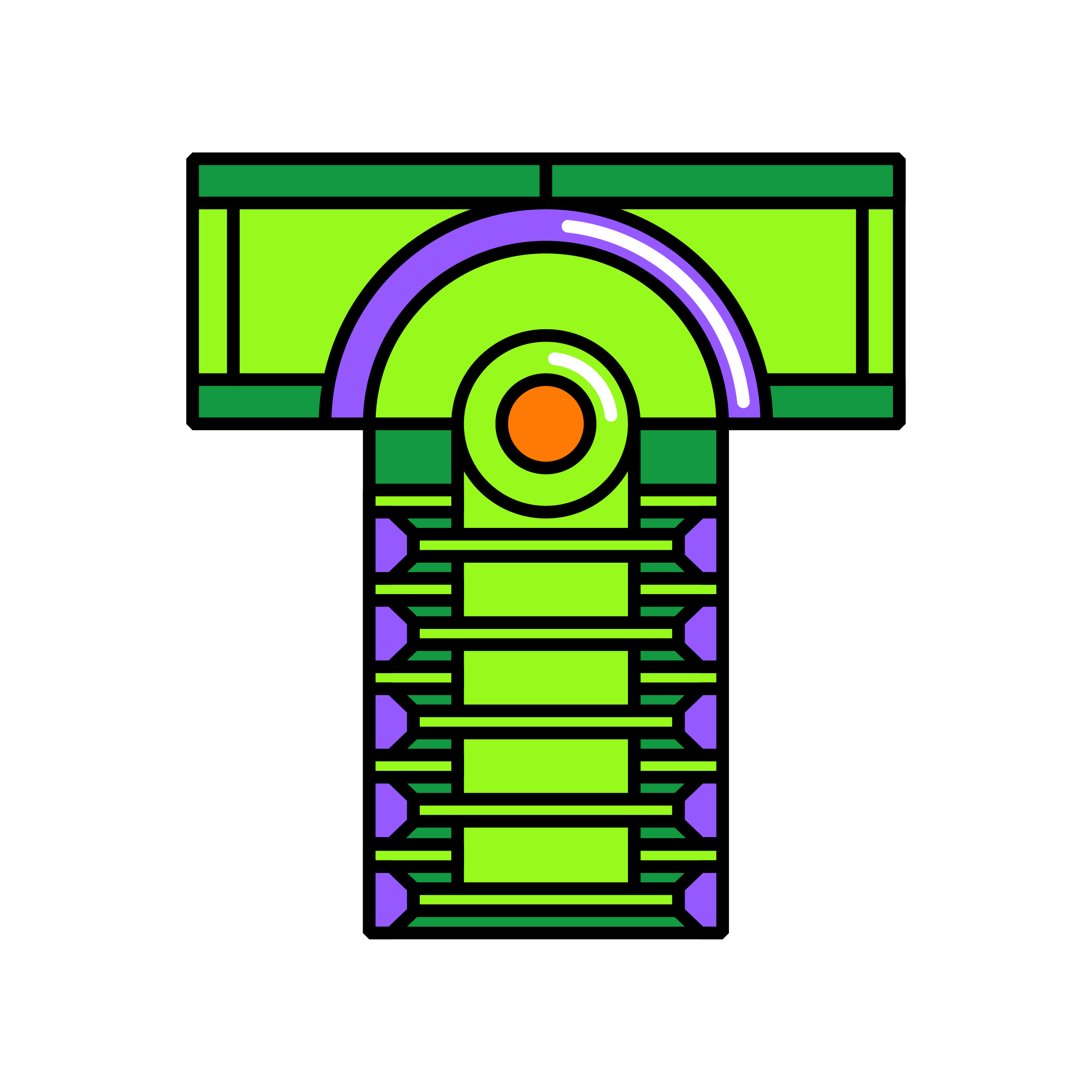
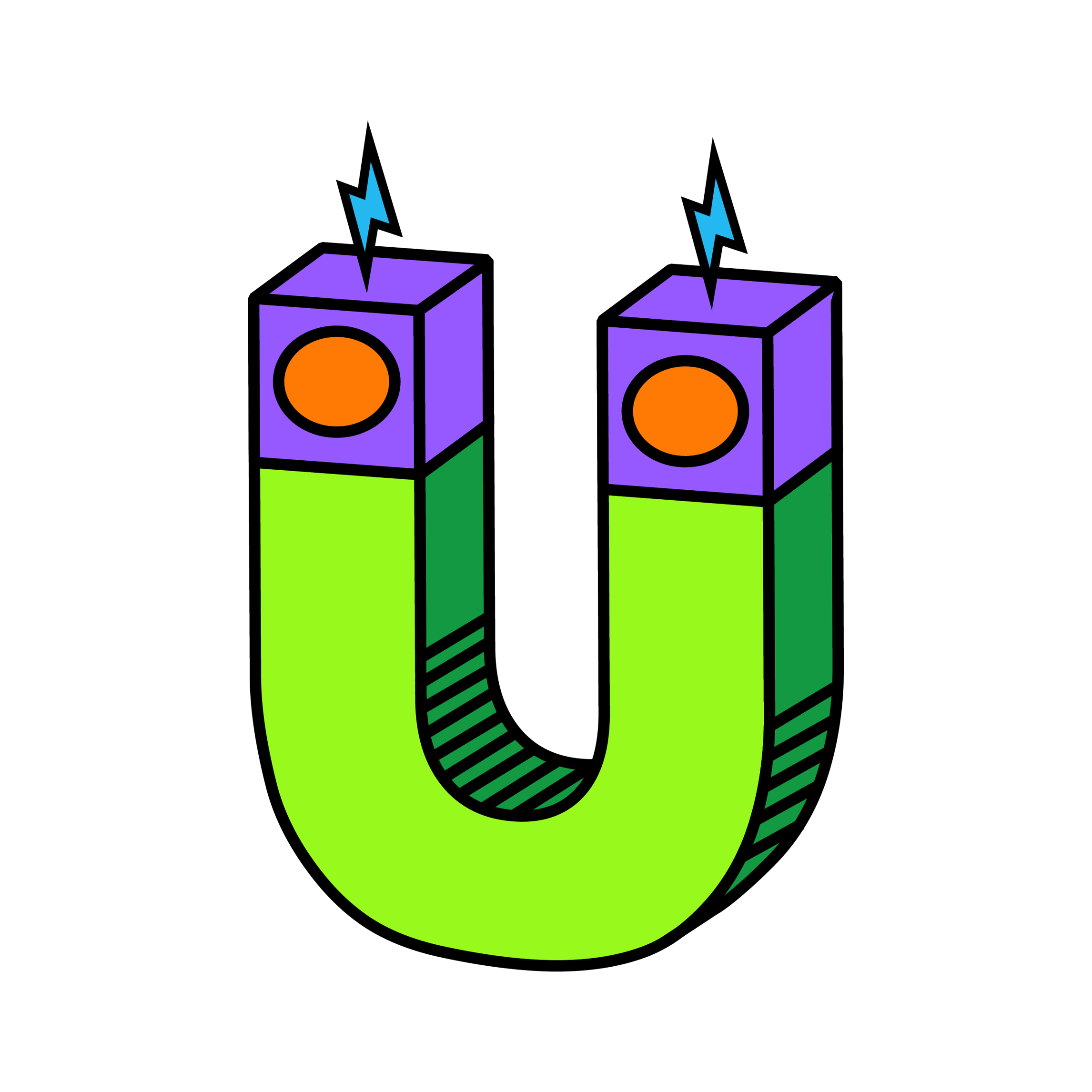
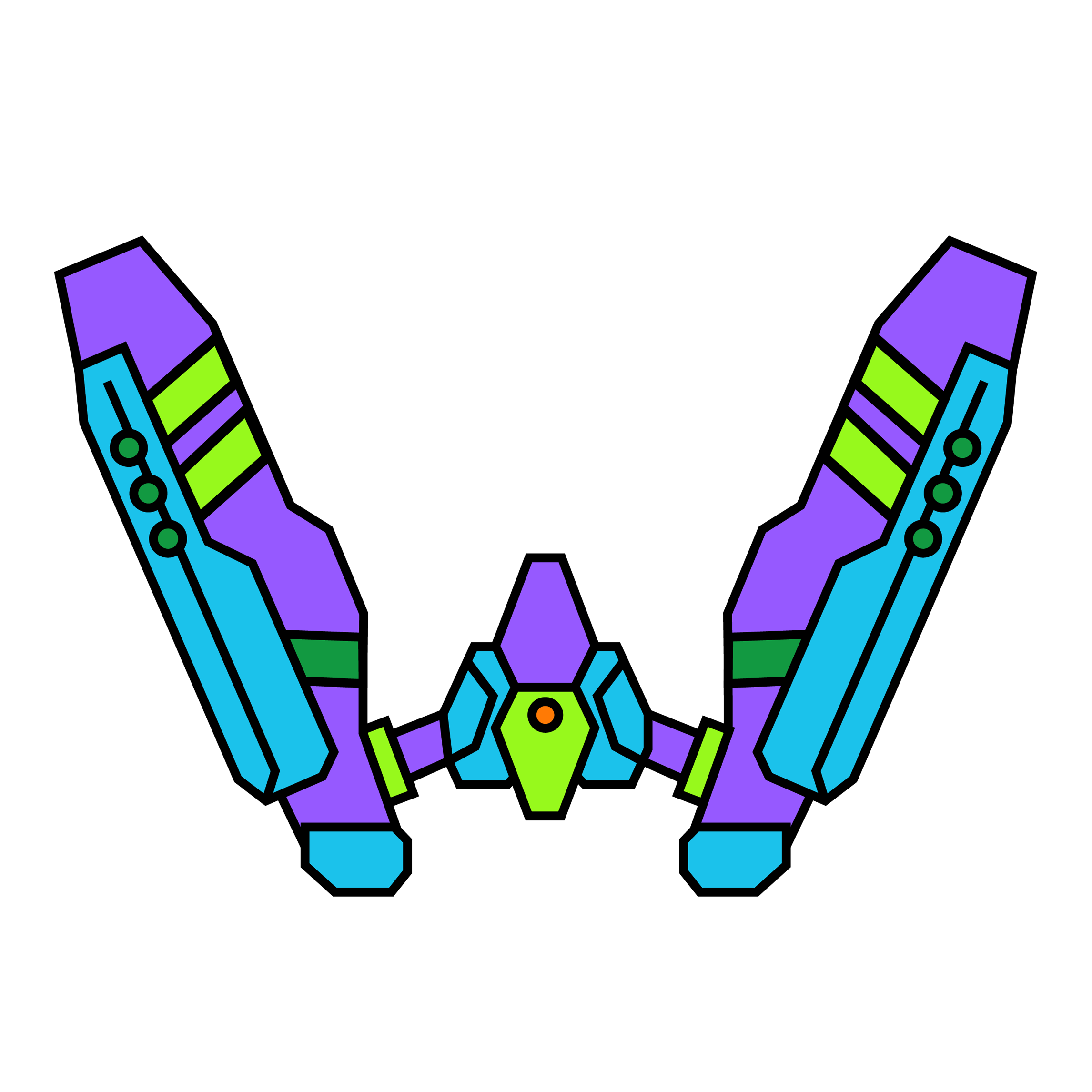
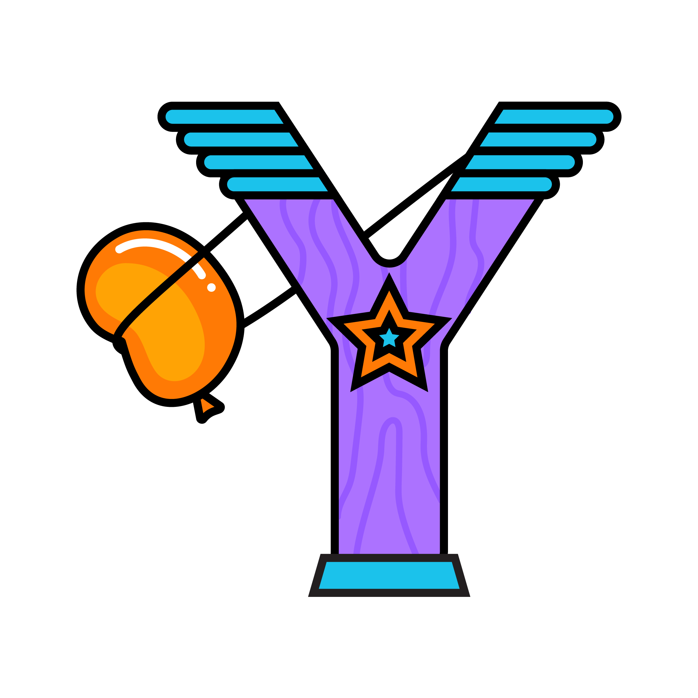
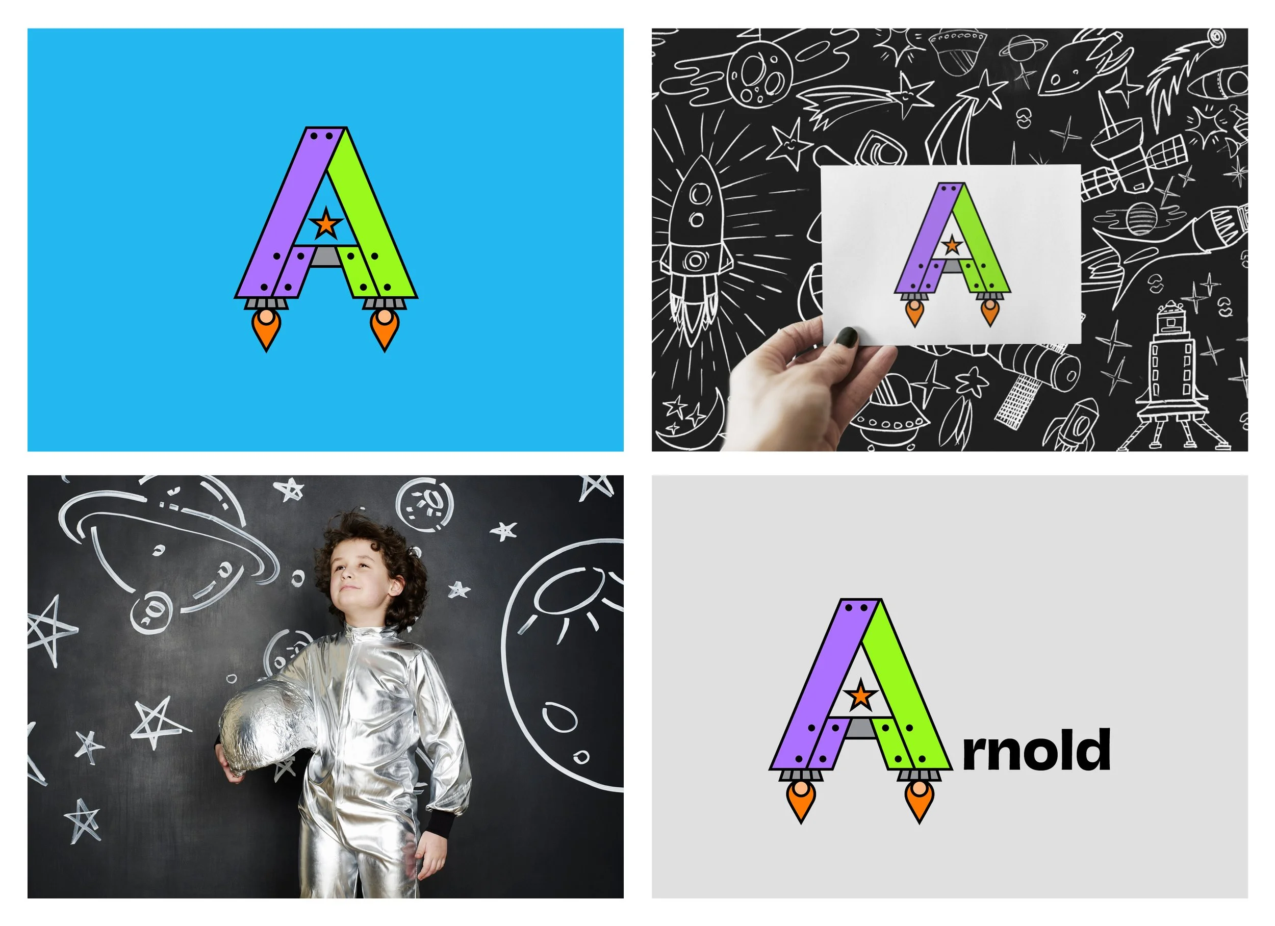
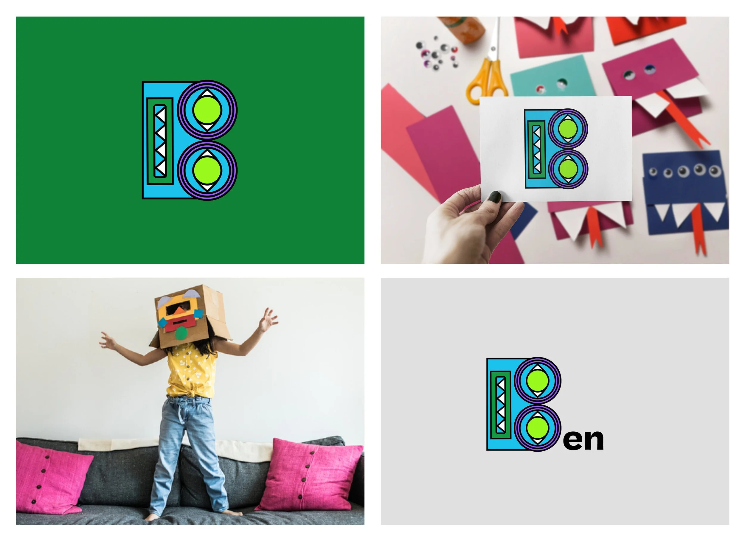
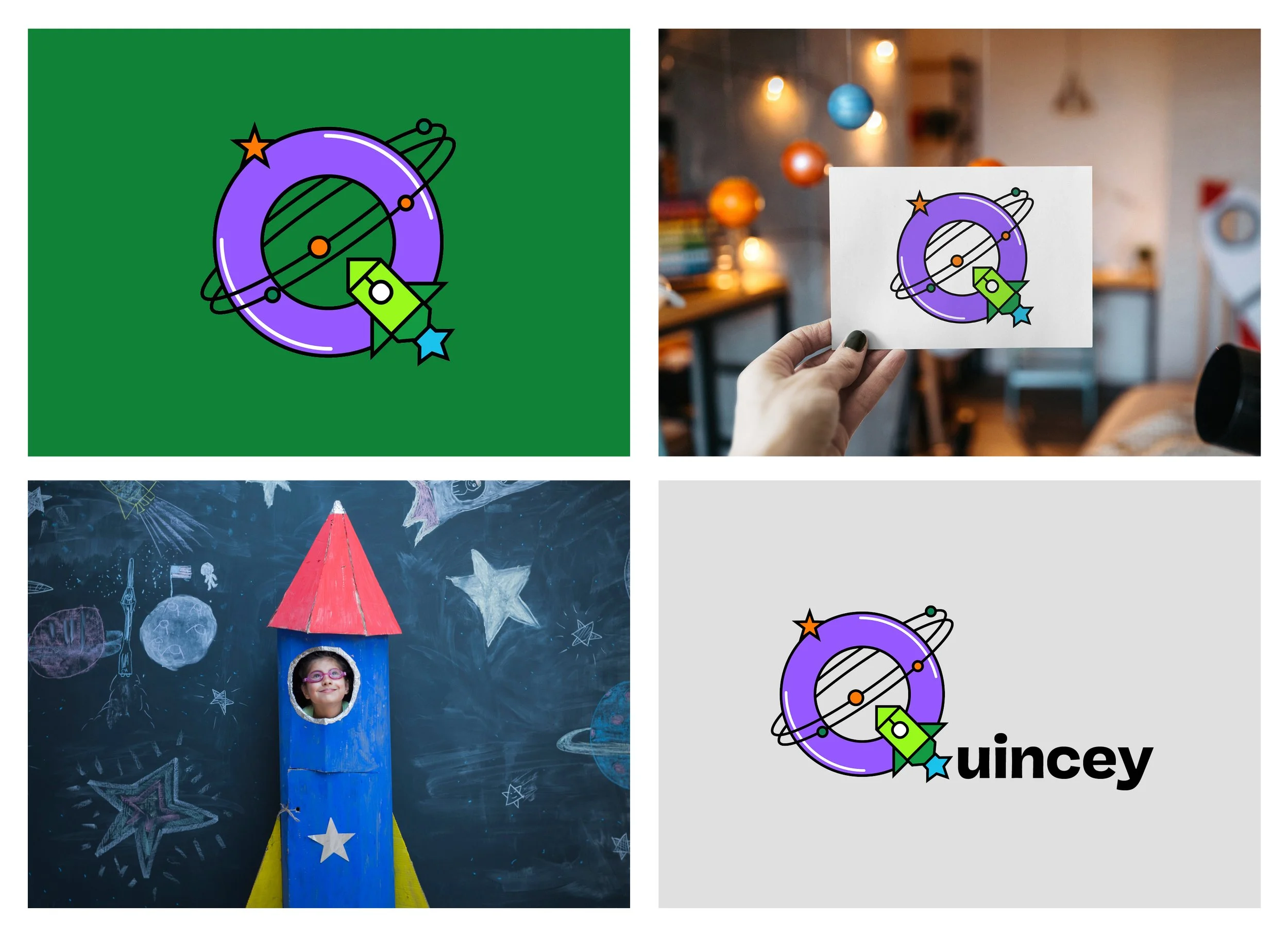
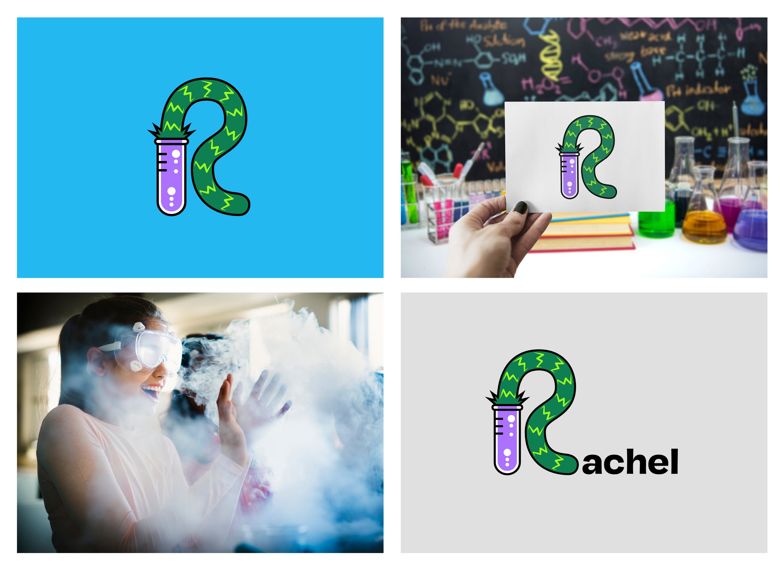
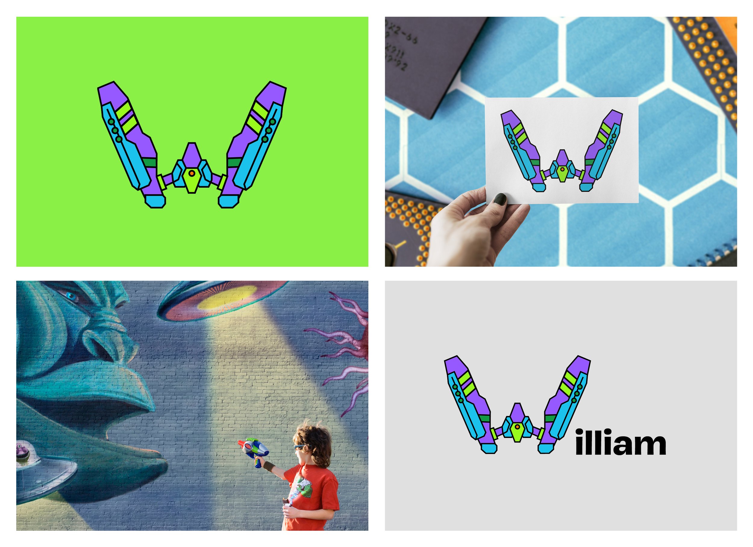
Heroic drop caps
The Forward to 175 Heroic Drop Caps are illustrated letters inspired by superhero badges and storytelling. A drop cap is a large, decorative letter at the start of a paragraph used to add emphasis.