Client: SAP
Role: Visual identity refresh and pictograms design
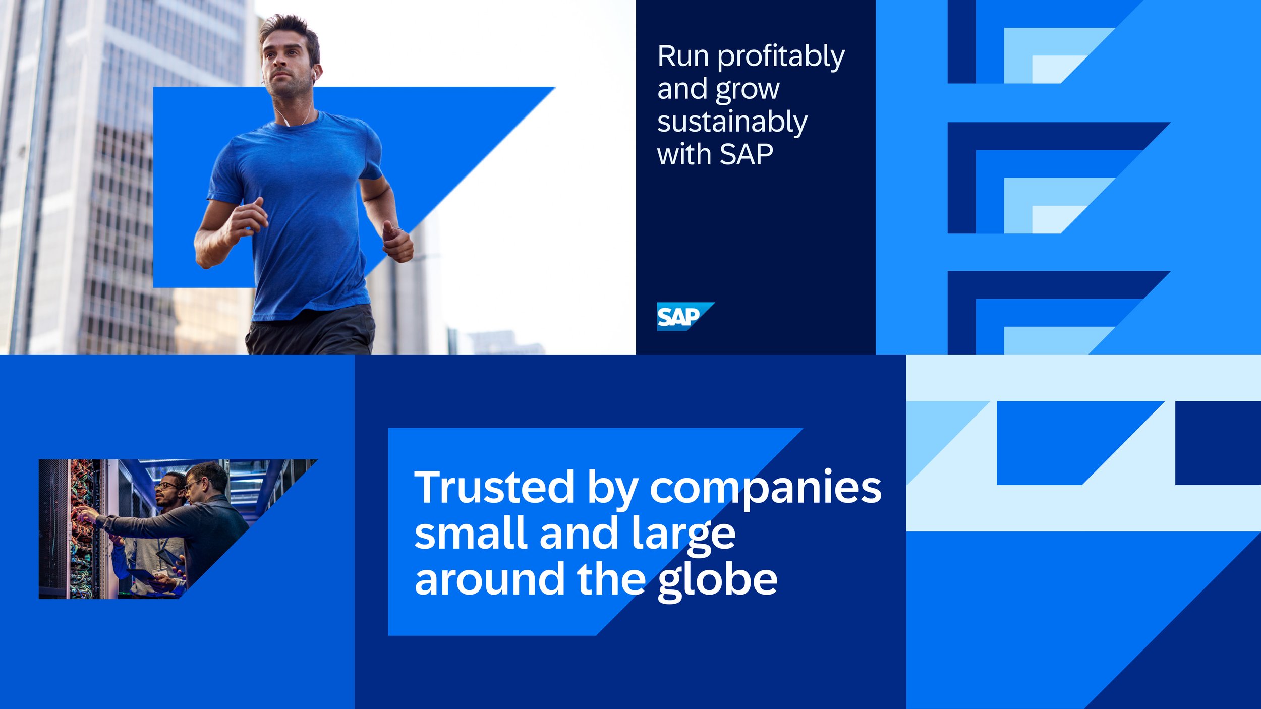
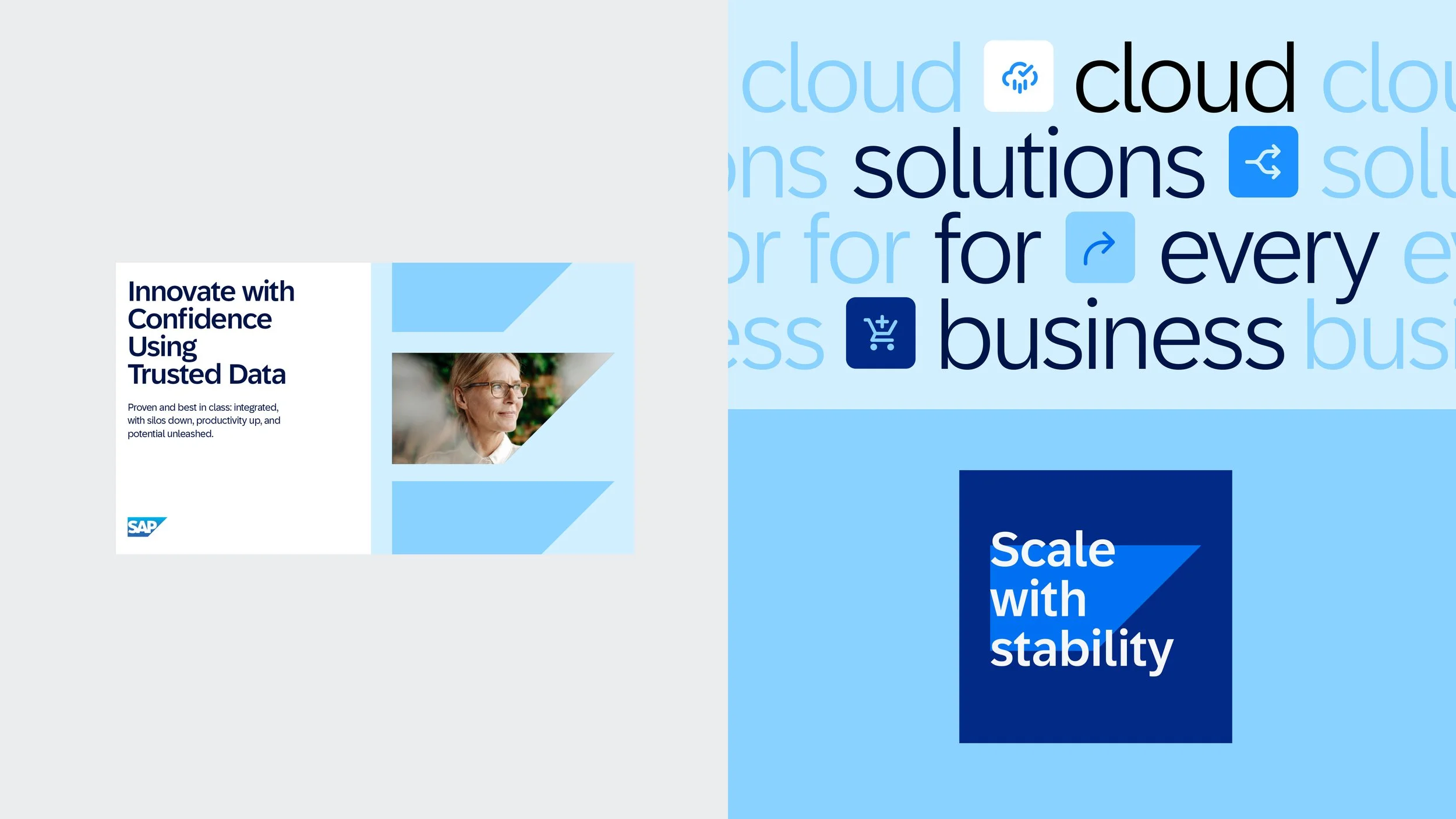
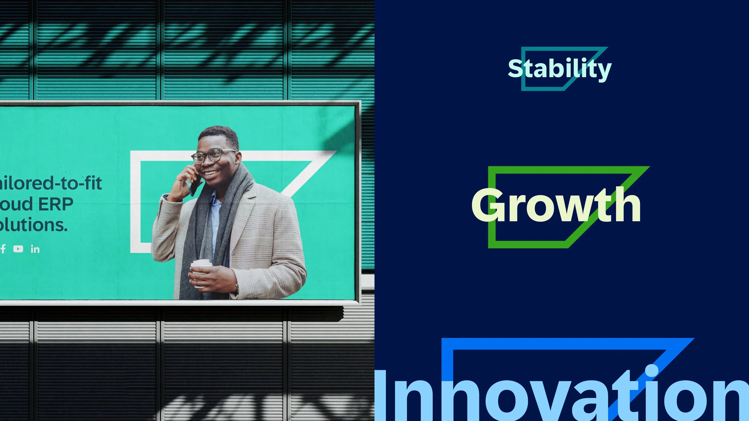
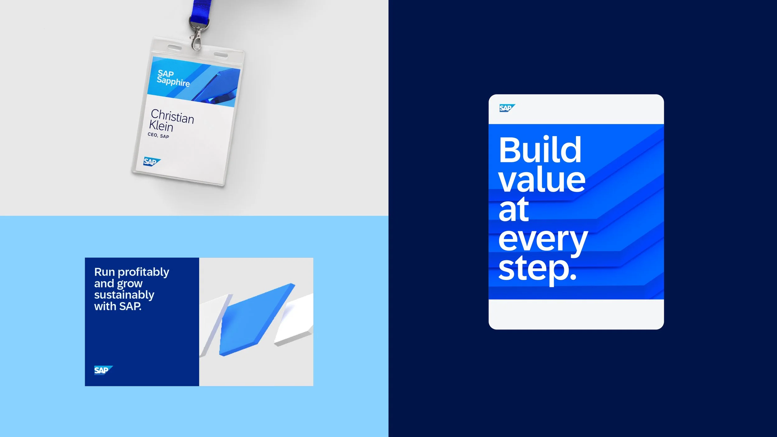
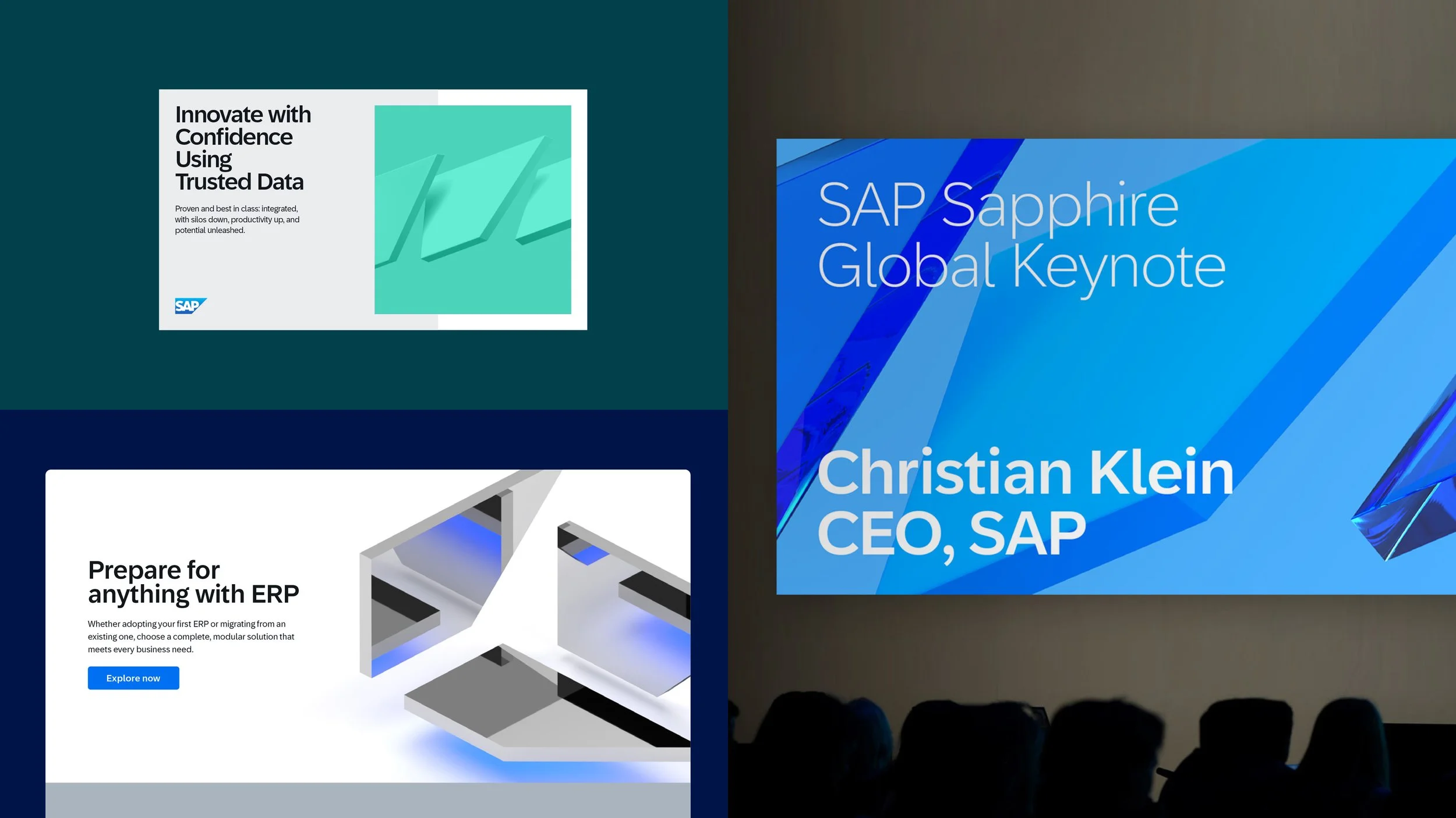
One System. One Brand.
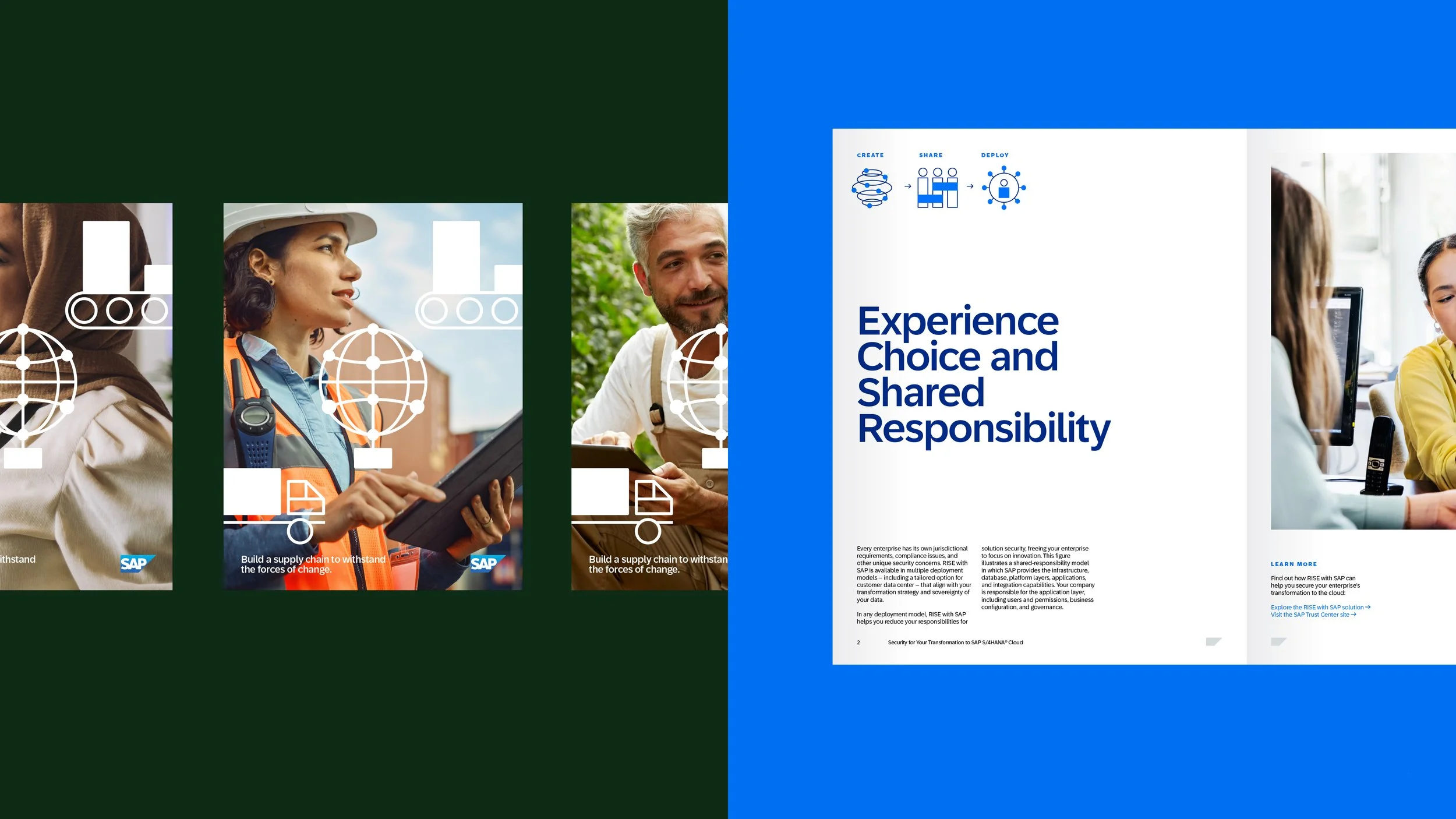
With all core components defined, a comprehensive communications system was developed to showcase the strength of a unified visual identity across internal and external touchpoint. The refreshed identity debuted at Sapphire, SAP’s flagship customer event, bringing together senior executives and decision-makers from around the world.
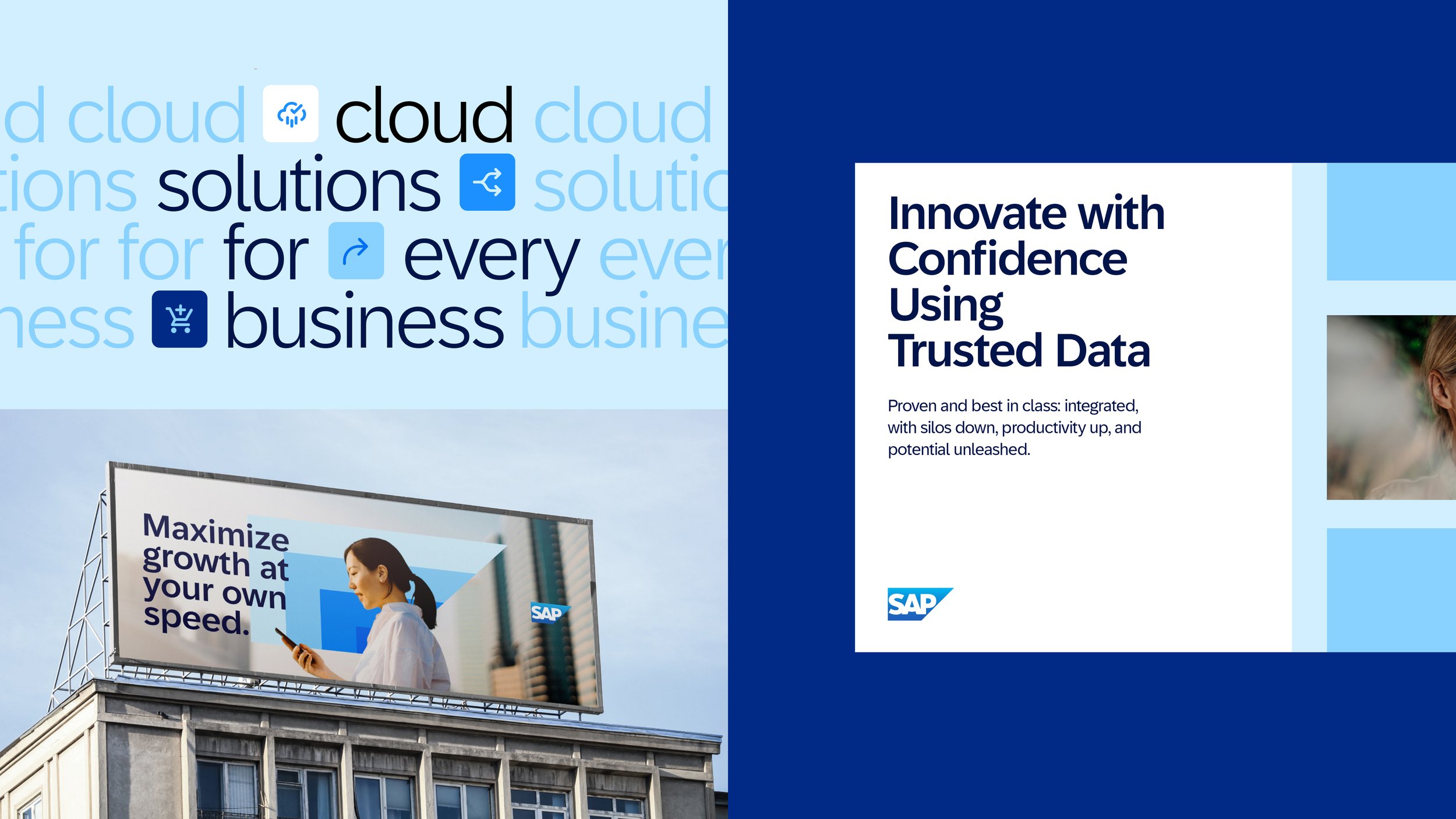
Our Brand Drives What We Make, Say, and Do
This refreshed visual system is designed to excite and engage the next generation of SAP fans. Flexible yet consistent, it deepens emotional connection while driving brand preference, usability, and growth.
Colors
Blue is a primary color, supported by secondary colors that add warmth and brightness. The balance of color is important to reflect the SAP identity. Learn more about SAP palette here.
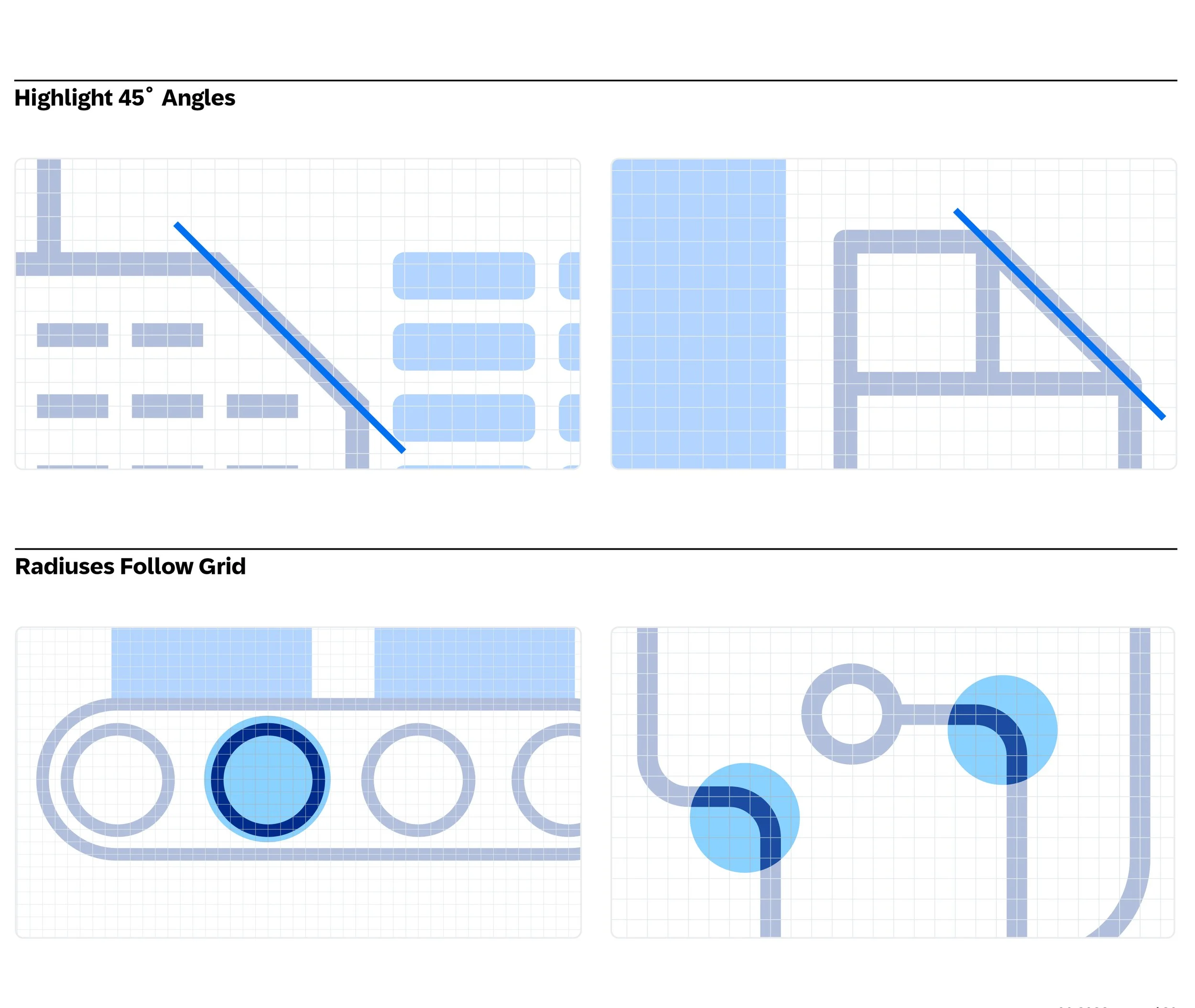
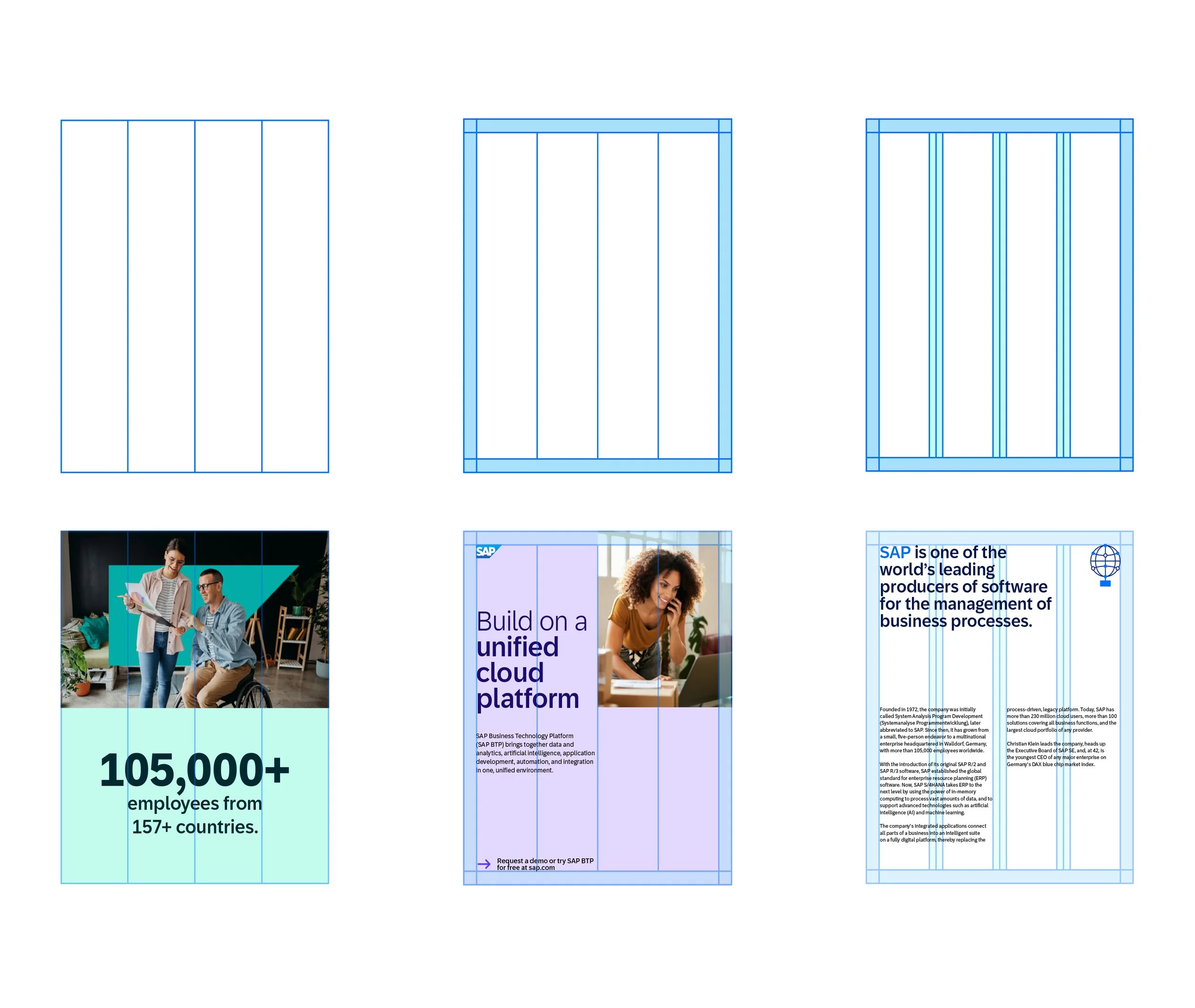
Grid
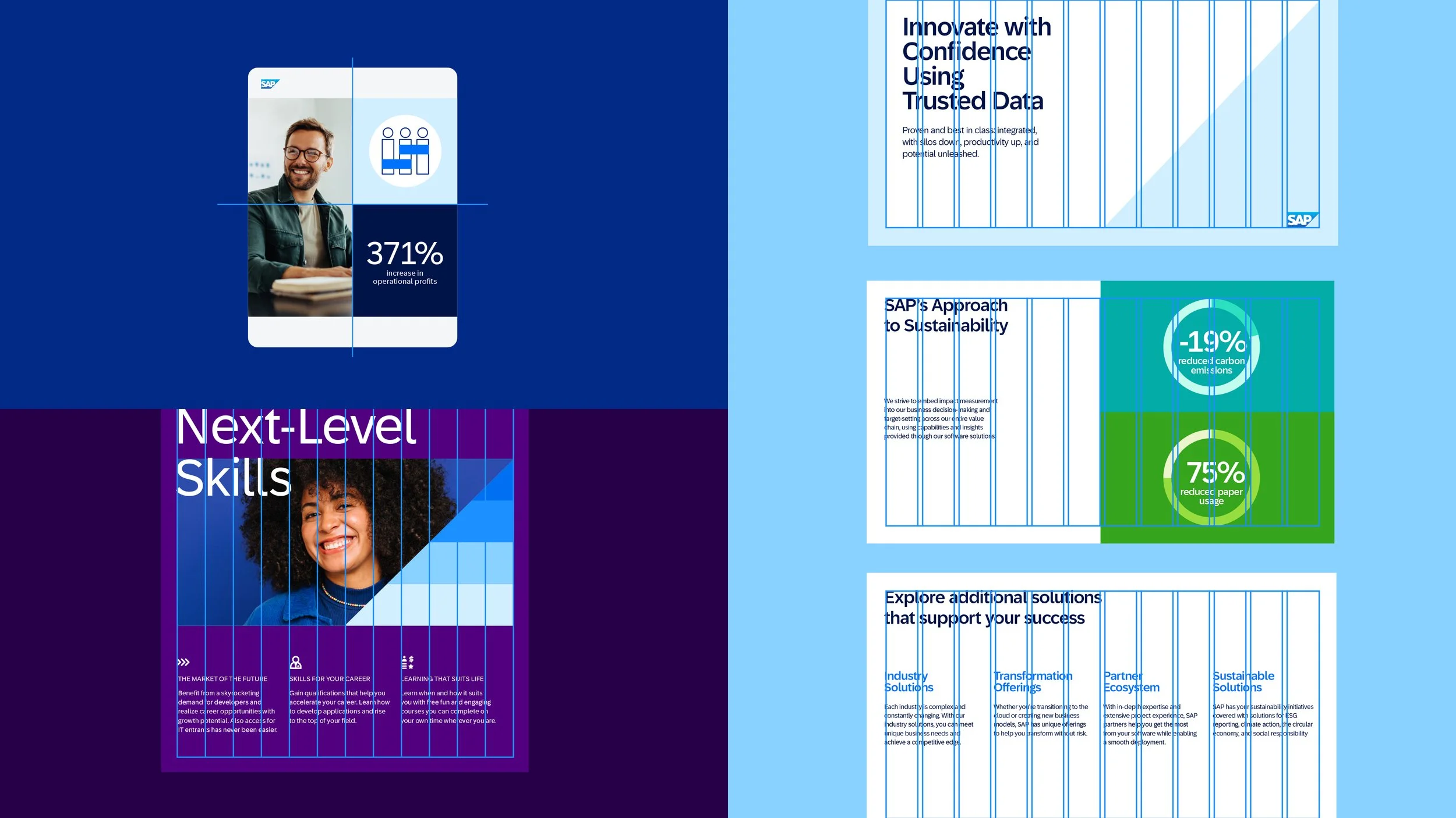
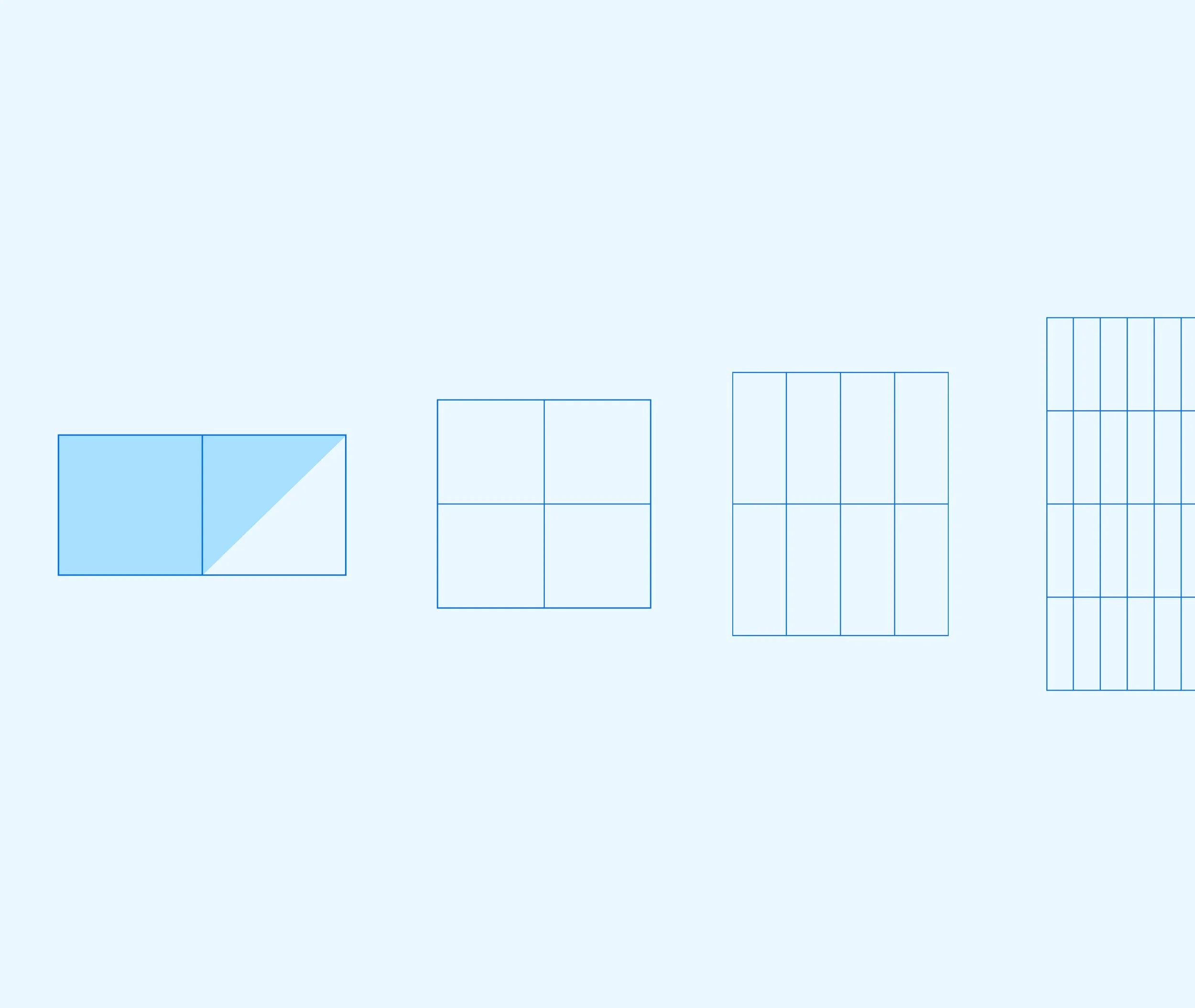
A strong grid provides structure without limiting creativity, helping organize content so visuals and messaging remain clear, balanced, and accessible.
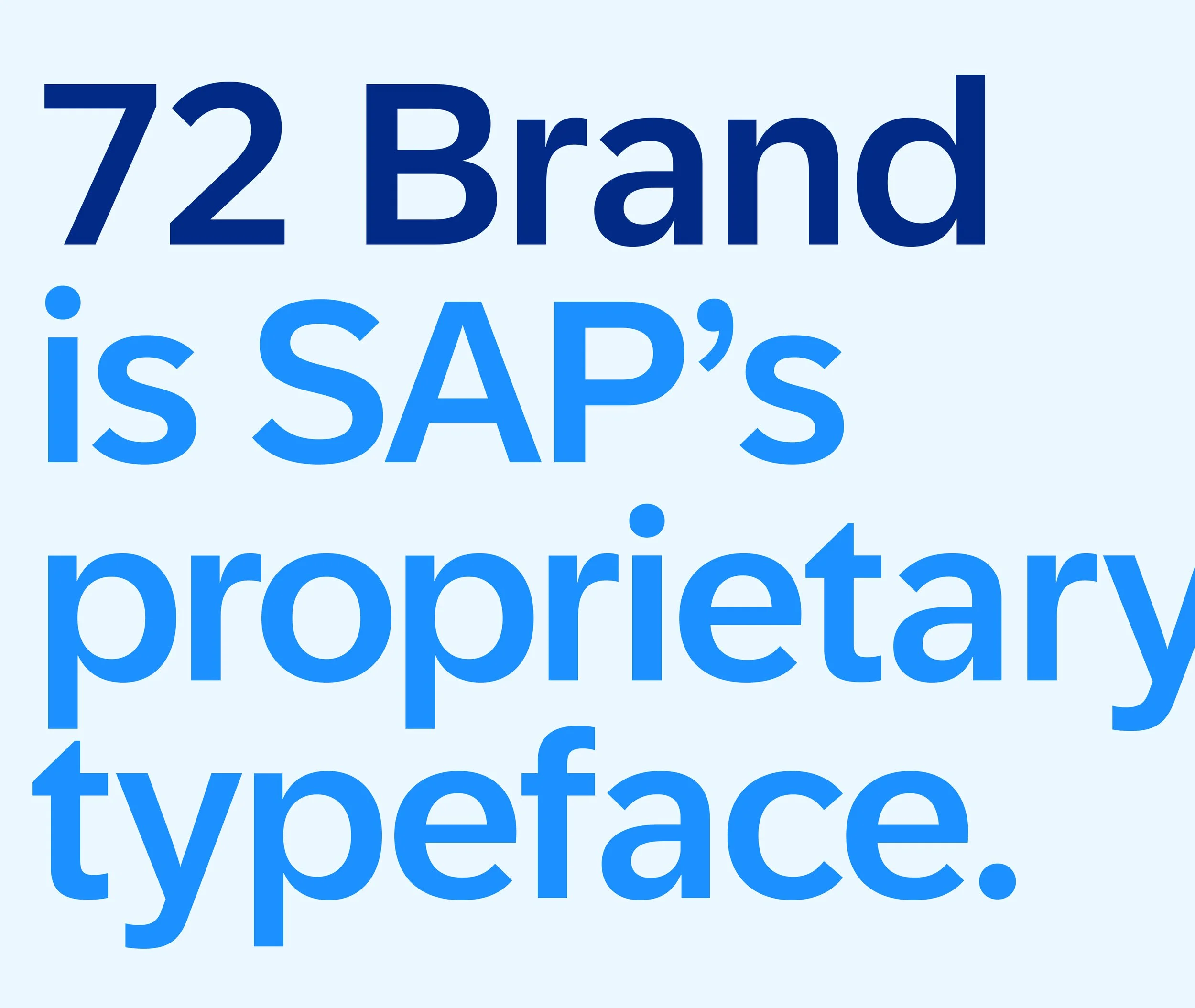
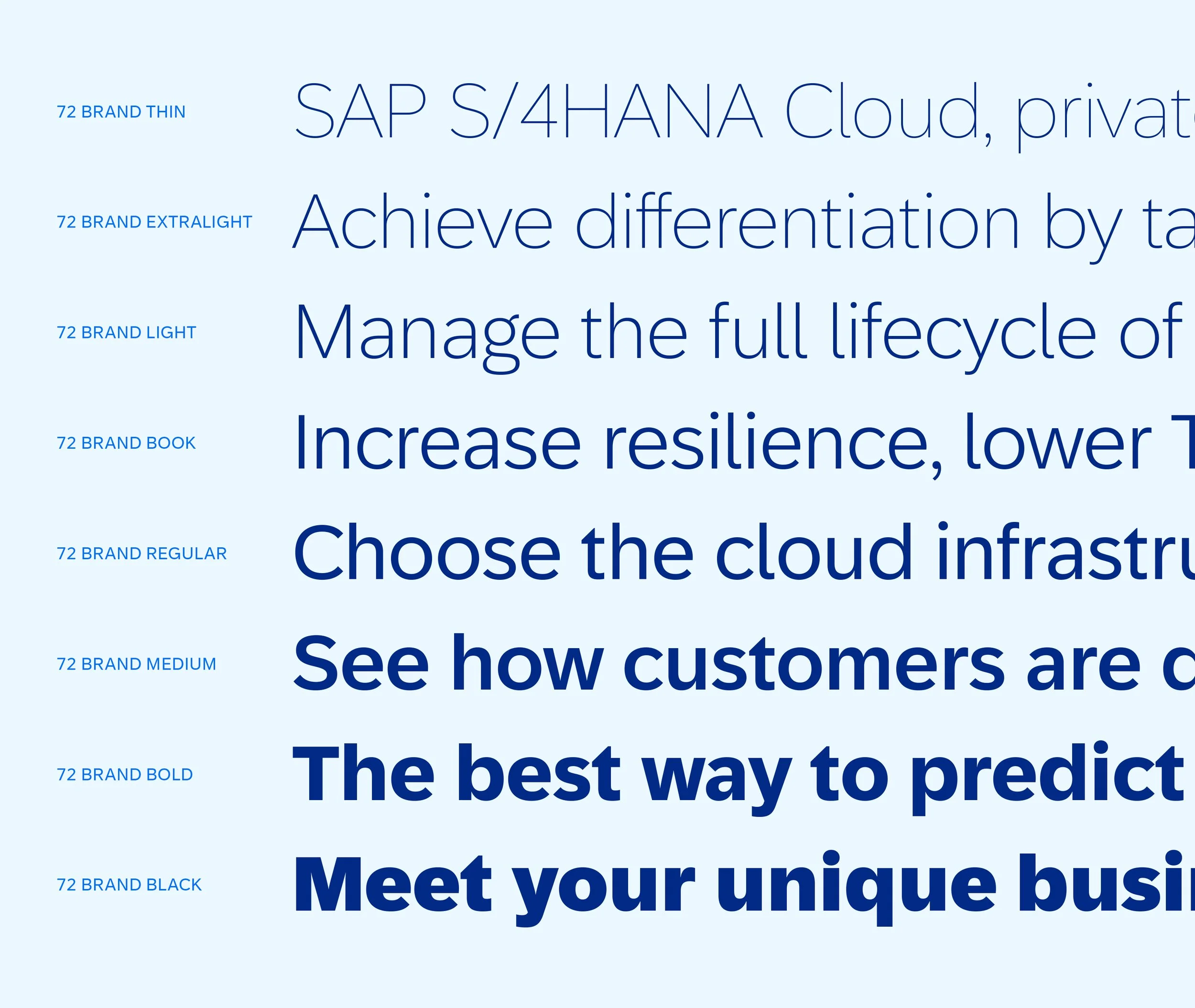
Typography
72 Brand is our primary typeface designed to create a unified, expressive visual voice across all communications.
For SAP Fiori typography guidelines, visit here.
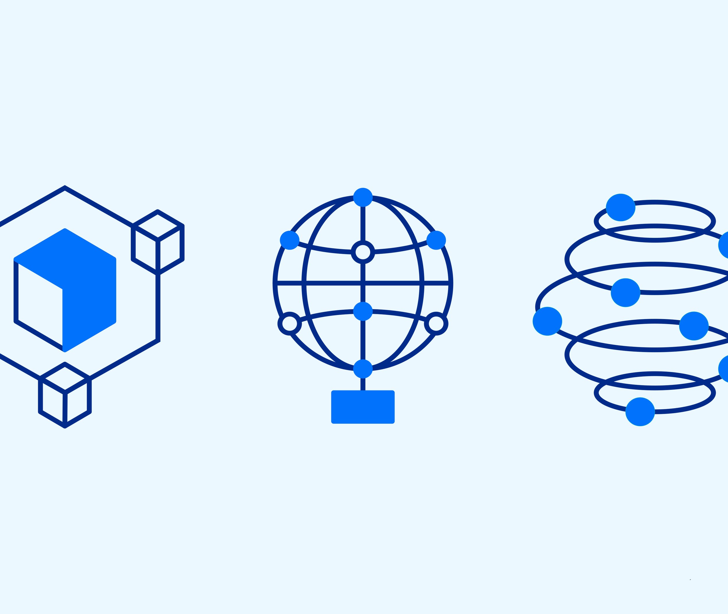
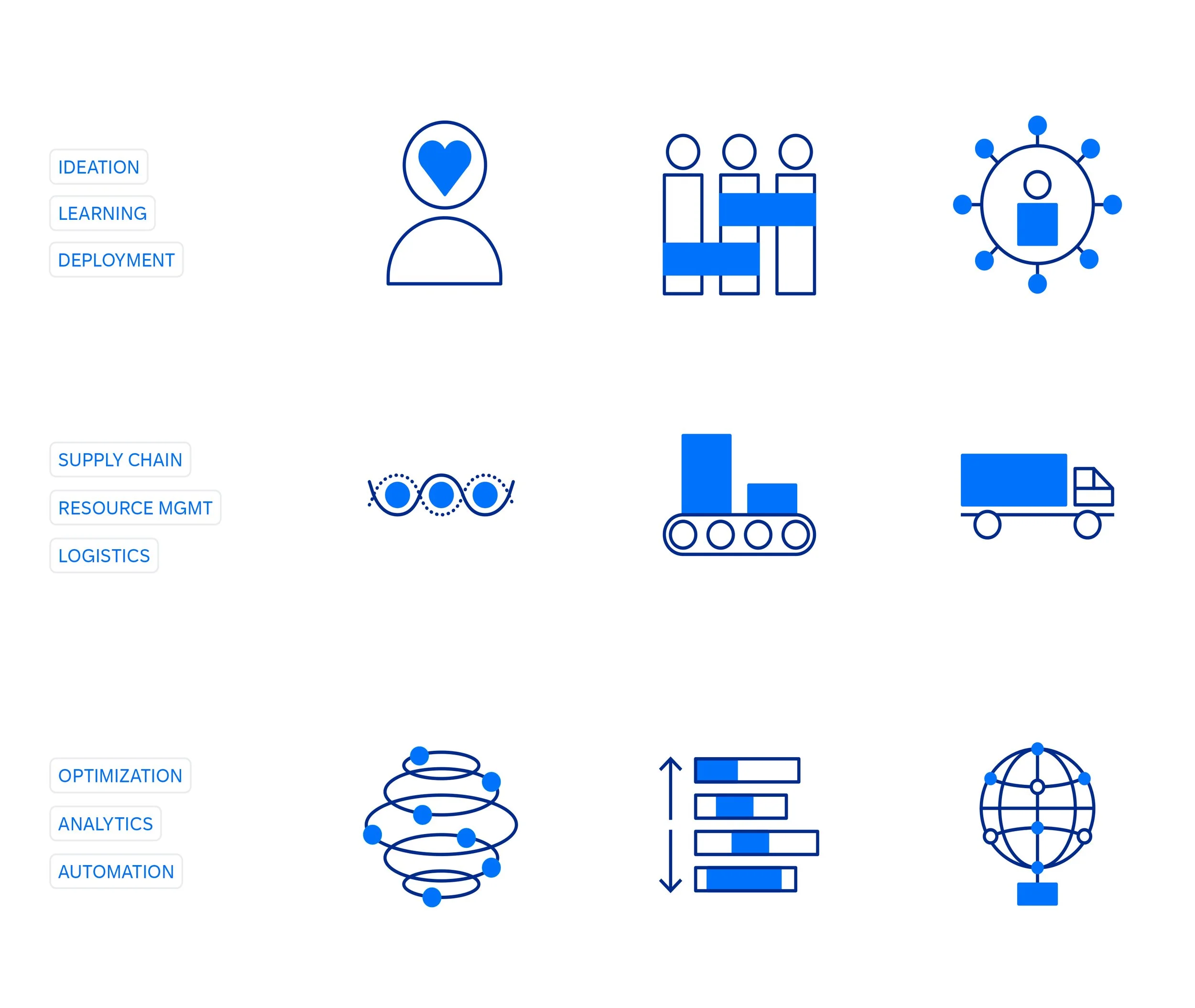
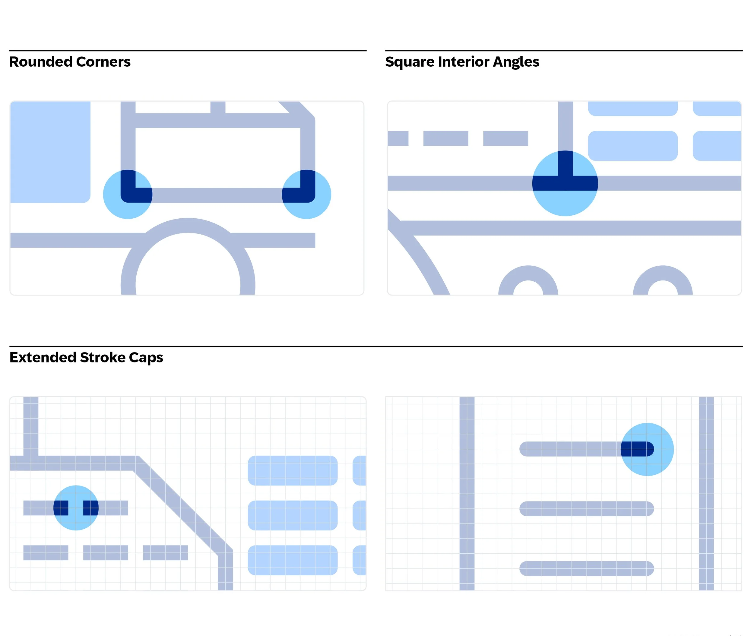
Pictograms
SAP pictograms are compact 2D illustrations that translate complex technical or business concepts into clear, universally recognizable visuals.